I love to create cards and it seems people enjoy receiving them. You'll often find me amidst a stack of paper, glitter, stamps and inks playing with my supplies. If you would like to make an order, email me at cardsbycara AT hotmail DOT com
The phenomenal Laura Bassen shows us how to do double partial die cutting and I haven't done this awesome technique for a while. My first try had some slightly over zealous cutting and I cut too far with one of the Wet Paint dies since I couldn't see ... next time I will try with a negative piece to position it better ...
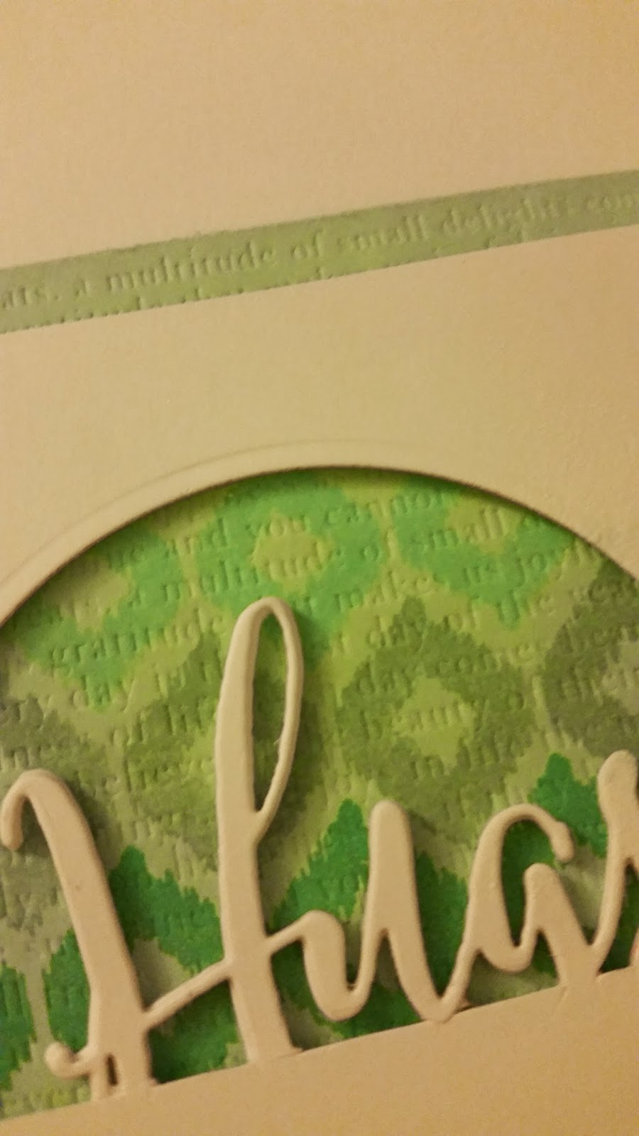
I took a cursive Hugs die and a circle die and did the partial die cutting on a Recollections 110lb white card front. I also die cut four more Hugs die cuts to pop it up and add some dimension combined with foam tape.
I stamped progressively darker colours using the Irresistible Ikat set and then added some Text Impressions dry embossing with one of the PTI impression plates - love those to add a little extra somethin' somethin' ... :)
Here you can see some of the texture and die cutting up close:
Inside I used the ampersand from Bountiful Banners and the Easter wishes stamp from Mega Mixed Messages - so many useful sentiments in that jam packed set!
I used Papertrey's colour combination as a bit of inspiration for a shaker card. I don't have adhesive foam so used three layers of adhesive cork - it worked really well, actually!
I stamped the feather image using Fresh peach ink and then added an Aqua Mist panel over top. Lots and lots of shimmering clear sequins and that's it! I was going to add a sentiment and/or use an impression plate on the Aqua Mist panel but kept it simple and added nothing else ... In hindsight, I think a bit of dry embossing would've been quite nice but alas ... :)
It's actually quite nice to have some sentiment free cards on hand - you can stamp one to the inside to personalize or just keep it sentiment-less ...
The fabulous Heather over at Papertrey shared the technique of velveteen stamping - layering darker inks over white stamped backgrounds. Here is my attempt: I used Papertrey's Background Basics Newsprint on the background using Colorbox Frost White - a great white ink that is nice and crisp on dark card stock (not that you can see that here!). I then layered Fresh Pear inked Turning a New Leaf all over the cardbase.
It doesn't look like the Think Big sentiment is that dark but in person, it does stand out quite a bit more ... I am definitely no photographer! :)
The newsprint looks really cool in person - love this technique! I first saw it on another blog a while back and was impressed that such a thing was possible. Thank you, PTI, for reminding me of it!! So, have you tried it yet? Share your creations below! :) ---- If you are in need of some crafty supplies, check out my sale page here.
Supplies: Paper: Recollections 110lb white Stamps: PTI Turning a New Leaf, BB: Newsprint, Think Big (sentiment) Inks: Colorbox Frost White, Fresh Pear and Navy
SAF2013 had a great inspirational post that I loved!! The idea of scratch and sniff cards is so cool and I mixed some clear embossing powder with cinnamon to make a card to accompany a holiday treat.
I took a Rustic Cream card base and stamped the Mistletoe and Holly background in Fresh Pear ink. I layered a Versamark inked Think Big background on Kraft Cardstock and then the Holiday Treats text block using Fresh Tuscan Olive. I used my homemade scented embossing powder on the little gingerbread man - the scent is awesome!! :-)
Papertrey is back with another Make it Monday video for inspiration. I love this technique and have done it before ... I pulled out an old favourite set of mine - one of the first I purchased, actually!
I heat embossed the black ink (stamped in Versamark first and then
Memento Tuxedo Black) before using ink pads with an aqua brush to colour
in the flowers and the leaves. I altered the colours and went with
imperfection ... :)
I used a sentiment from Movers and Shakers on the front and on the inside reading I am reminded how wonderful you are. The flower is up on foam dots and the leaves are glued with Tombo Mono Multi glue and then curled up a bit for dimension.
Have you tried this technique before? How do you like it?
Supplies:
Paper:Kraft, Smokey Shadow; Staples 110lb white
Stamps: PTI In Bloom, Movers and Shakers; Studio Calico Houndstooth cling stamp
Ink: Distress Inks Peeled China, Bundled Sage, Weathered Wood, Peeled Paint: PTI Vintage Cream; Versamark, Memento Tuxedo Black
Misc: foam dots, Tombo Mono Multi glue
I have done the letterpress technique before - here and here - and quite love it but decided to revisit the technique with my Fresh pigment inks and really ink the impression plate quite heavily. Then I ran it through my Big Kick as usual with the embossing mats. I did this with a whole bunch of impression plates and here are my creations:
This one has an Angled Labels window cut out with some acetate and a vellum butterfly (Pretty Peonies die) that has been impressed with the Mehndi Medallion impression late.
This ink pad is really juicy so the ink looks slightly mottled here but has evened out now.
My next one uses the Mehndi Medallion impression plate inked up with Pool ink:
The sentiment is from a new MFT set from a generous friend. Great font, right?
Since I am on a hexagon kick still, I inked up the hexagon cover plate with Harvest ink:
There is a clear window cut out and backed with acetate:
And my last one was not perfectly inked up with the ink pad so this one didn't turn out quite as well:
The Cane Print impression plate with some Provincial Gray ink pad and selectively inked Mat Stack 1 sentiments:
Have you tried this tecnique? Any good results to share?
I decided to make a shaker card for my cousin who loves interactive cards! I die cut a Beautiful Blooms flower out of Amy Butler Lotus patterned paper and then added some acetate for the window. I punched a bunch of small circles with a hole punch from Summer Sunrise, Melon Berry, Berry Sorbet and the Amy Butler Lotus patterned paper.
I added a Dark chocolate hole punched cirlce and then a gold gem to the centre of the flower. A banner from Summer Sunrise and an Everyday Button Bits sentiment complete the card.
Shaker cards are so much fun - I will definitely be making more of them in the future!
This week over at Papertrey Ink, the talented Erin Lincoln showed us how to make puffed fabric accents:
I took out some dies and went to town. With the Sending You dies, the smaller one doesn't have one to nest so I cut some foam dots and stacked them instead.
I also didn't have fun foam so I used a stacked pile of cardboard die cuts instead for the other one. It works just fine! In the video, Erin used fabric but I decided to use some felt instead. Love the tactile element it adds!
I did some impressing with the canvas impression plate for some added texture.
For my next card, I used a stack of Beautiful Blooms with white felt:
For this one I used the Newsprint stamp as the background and then layered the puffed felt accent up on top with a button.
A colleague's father passed away so I had a sympathy card to make ... I kept it simple and more masculine:
I just love the Mehndi Medallions set. I requested it a long time ago and was so excited to see it come out! And my comment was picked as the winner so it actually was in a prize pack I received - I felt so lucky! :)
Supplies:
Paper: PTI Kraft, cardboard
Stamps: PTI Turning a New Leaf, Think Big Favourites
Ink: PTI Vintage Cream, Memento Tuxedo Black
Misc: Sending You dies, foam dots, scor tape, Linen impression plate, Simply Chartreuse felt
Paper: PTI Fine Linen, Aqua Mist
Stamps: PTI Newsprint, Botanical Silhouettes (sentiment)
Ink: PTI Vintage Cream, Jenni Bowlin Spiced Tin
Misc: Beautiful Blooms dies, Tag Sale die, white felt, button, button twine, scor tape
Paper: PTI kraft
Stamps: Mehndi Medallions, Botanical Silhouettes (sentiment)
Ink: Jenni Bowlin fountain pen, chili powder, brown sugar
I saw this great challenge over at the Embellish (online) magazine and thought I'd use it as a jumping off point. Here's what I came up with:
Although I love bicycle images, it turns out I only have one bicycle image in my stash from Papertrey's Everyday Button Bits. I thought I'd find a vintage looking digital image online and try an inking technique over top ... I printed it in a grey tone so it is not so stark against the ink.
I loaded my indestructible craft sheet with Distress Inks in rows of colour, spritzed with Perfect Pearls and Studio Calico shine mist and then smooshed my background stamp into the inky mess. It gives a sort of watercoloured muted tone to the inks.
You can't really see the shine in the picture but it's there, promise!
And card #2 ....
For this one I used some more of the ink that I had left over to stamp another background with my Hero Arts Classic Fabric cling stamp:
This is such a simple technique but I am definitely going to try it again. Since I wanted four colours descending down my card, I just used the edge of my Distress Ink to put colour on my craft mat rather than the whole square. That way, I was able to squeeze all four colours in.
Some buttons and a sentiment and that's it!
I had lots of ink left on my craft sheet so stamped another three backgrounds and even spritzed some more to ink up some sticky back canvas I got on clearance! You will probably see those inky backgrounds in some upcoming posts .... :P