Showing posts with label cards techniques. Show all posts

Monday, September 12, 2011

Make it Monday - Stamping with Acrylic Paint

I was so inspired by the fabulous video this week from Papertrey on stamping with paint.  I went through my stash and found some gold paint and grabbed a makeup sponge.  My new set Harvest Berries was perfect for this.  I love the combination of Ocean Tides and gold.  Yum!

 I used the Harvest Berries die for some dark chocolate and gold texture and overlaid a Fillable Frames #4 die cut with some foam dots.  I found the perfect sentiment from Modern Wood Mats and made sure to edge the frame and ocean tides cardstock cover with the gold as well.
I think somehow the colour combination reminds me of Tiffany with the gold and turquoise, although it's usually lighter.  Canada used to have a gorgeous home decor store that was an offshoot of Club Monaco called Caban that always used the turquoise and chocolate brown combo .. love it!
I think this shot might show the amazing shine better.  Hard to capture on camera, especially at 10:30 at night! :)  Ah, well ... you get the idea!
Supplies all PTI unless noted:
Paper: Ocean Tides, Chocolate, white card base
Stamps: Harvest Berries, Modern Wood Mats' sentiment
Ink: gold paint (Plaid)
Misc: Harvest Berries and Fillable Frames #4 dies, foam dots

Friday, May 13, 2011

PTI Make it Monday - selective inking

This week's video technique was selective inking.  I do this often to create the exact sentiment that I want.  All you do is ink the portion of the stamp you want - with clear stamps and raised ink pads, this is very easy.  Here are some of my creations:
I did this one with lots of layers.  A layer of Ocean Tides impressed with the text impression plate.  Then a layer of Basic Grey Basics manila paper, a Melon Berry Mat Stack 4 stamped with Background Basics: Retro, and then the numbers with the Outline Alphabet and the sentiments selectively stamped from Mega Mixed Messages.  I edged with some Colorbox Frost White and mounted the die cut on foam dots.


This red one was a square 5x5 card of Scarlet Jewel.  I cut out a Delightful Doily in vellum, then stamped it with the tree image from Little Bitty Bird.  I also die cut the bird to put on top with foam dots.  I was able to adhere this vellum layer to the card with a glue dot behind the bird.  I stamped a label image from Mat Stack 4 in Colorbox Frost White on Kraft and cut it out.  I then selectively stamped the sentiments from Little Bitty Bird as well as the hearts.

The inside sentiment is also selectively stamped with two different sentiments from Little Bitty Bird.  It is a bit hard to see but click the pic for a larger view.


Supplies:
Grad Card
Paper: Staples Cream 110lb card base, Basic Grey manila basics 8x8 pad, PTI Ocean Tides and Melon Berry
Stamps: PTI Outline Alphabet, Mega Mixed Messages, Background Basics Retro
Ink: Versamark watermark ink, Versafine Onyx Black, Colorbox Frost White
Misc: PTI Text Style impression plate, Mat Stack 4 die,  foam dots


Little Bitty Bird
Paper: PTI Scarlet Jewel, Kraft, vellum
Stamps: PTI Little Bitty Bird, Mat Stack 4 collection 
Ink: Brilliance Coffee Bean, Versafine Onyx Black, Colorbox Frost White
Misc: PTI Delightful Doily die (large), glue dot, foam dot

Thursday, March 24, 2011

Double embossing PTI style

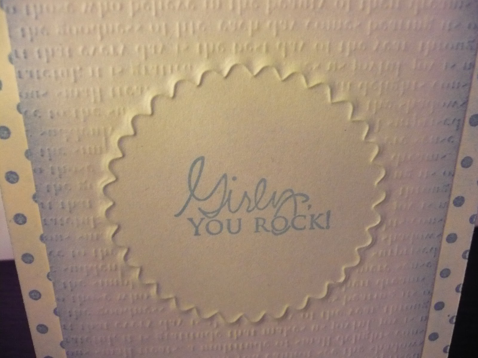
Well, I learned a new technique today courtesy of the talented Erin Lincoln and here is an example of a card I made using my newly found knowledge.  I used an impression plate and a die for a different look.

Here's another one I did using the same technique but with different patterns:

I did some sponging on this one and used Fresh Inks from Impress Rubber Stamps.


If you would like to try this technique, here is the 'sandwich' I used in my Cuttlebug:
A plate
B plate
Impression plate facing up
Die cutting side facing up
Paper facing down
Embossing mats - vanilla and tan
B plate

Wednesday, August 11, 2010

Thinking inking inspiration

I am constantly inspired by Jennifer McGuire and her great design sense and ideas.  I made this card based on one of her thinking inking videos.  I embossed the flower image with white embossing powder and then sponged different distress inks over top.  After that, I stamped a letter script stamp for a subtle layer.  The green mat is done with Papertrey Ink's Sunshine impression plate.  I am loving these plates for some texture.

Supplies:
Paper - Staples cream,  Gina K Pure luxury fresh asparagus, chocolate brown
Stamp: M's flower blooms, French script
Misc: Tombo glue runner, Distress Inks, white embossing powder

Friday, July 9, 2010

Another hello and rock and roll technique

A cute little tiny card that I used the direct to paper technique on at the edges.  I also did the rock and roll technique on the flowers to add some depth by adding a darker ink to the edges of the stamp.  Simple and clean.
Supplies:
Paper: Staples cream and white, Gina K pure luxury fresh asparagus
Ink: Distress Inks -- spiced marmalade, fired brick, shabby shutters
Stamps: M's hello, Impress flowers
Misc: pop dots

Tuesday, April 21, 2009

Flocking ...


I know, what does that mean, right?! Well, I am looking forward to trying it out on cards ... it is almost like a crushed velvet embossing process. Here's what one of my favourite websites says (that's where I got this picture from):

Use pigment ink to stamp your image. Powder your wet stamped image with sticky powder and heat until shiny. Do not overheat! Spoon flocking over yo
ur warm sticky design and press down with fingers before you pour off extra flocking. Heat again to harden off the powder.

Can't wait for my package of sticky stuff and flocking powder to arrive! Here are the powders I ordered:

Have any of you tried this technique? Any tips?