Showing posts with label dry embossing. Show all posts

Saturday, August 29, 2015

Stamp-A-Faire 2015 - Bridal Challenge: monochromatic white on white


The team over at Papertrey Ink have worked hard to create a day of crafting challenges and inspiration.  The first was a bridal challenge using white supplies. I loved the idea of a monochromatic card and kept mine super simple.
I took the Twist cover plate and embossed the background of a 110lb white piece of Recollections card stock.  I then die cut 'love' using one of the Wet Paint dies four times and layered them one on top of each other for dimension.  
I temporarily glued this to a piece of scrap paper and added Glossy Accents and then a healthy sprinkling of Ranger Rock Candy glitter.  

I decided to try another technique using some Versamark ink and Perfect Pearls powder in the shimmery silvery colour Perfect Pearl.  Confusing, right? ;)
I repeatedly stamped one of the vases from Gracious Vases and then added the powder over top. (You'll notice they're not even since I couldn't see where I was stamping due to the clear nature of the ink ... let's just pretend that I did it that way on purpose!)  I cut a strip of striped vellum and adhered a white Circle Scribbles die cut over top ... super simple and monochromatic.
Above you can see a peek of the inside of the card - I used Betsy Veldman's trick of an added pop of colour with a aqua mist card base.  Love this idea but always forget about it!
 I love the shimmer of Perfect Pearls but it is so hard to capture, especially when the sun is not out!  We have needed rain for a while on the West Coast due to the drought and forest fires but it is not ideal for good pictures with lots of natural light! :)
So what have you created so far?  Are you enjoying the festivities?
-------------------
If you have a moment, check out my gently used item sale *here*.  I have stamps, ink pads and other things too ...

Friday, July 10, 2015

Experimentation with 3D embossing folders

Hope you are having a good summer ... the weather here on the West Coast has been hot, hot, hot!  We had a heat wave with forest fires in the interior and up a bit more North ... so much smoke in the air even in the city.  It has started to lift, luckily, but the usual gorgeous ocean views are a bit muted even still.

Here are some pictures from a walk along the sea wall last night:

 And here are the views you usually can see:

Crazy, right?  Well, the weather has started to cool and we are supposed to get some rain this week (less than 1 mm but better than nothing!) so things are looking up. 

Ok, on to the crafty part of this post ... :)

I was so excited to use my new Next Level 3D embossing folders and PTI dies... what fun!  The folders are from We R Memory Keepers.   The cool thing is that they emboss on many different levels so they are something fun and new.  

I bought the Gemstone pack because I love hexagons and the other one really intrigued me too.

I made a super simple embossed panel in Gina K orange and added a PTI Tropical Teal Scripted die cut using four layers built up with some Glossy Accents in between.  Sometimes I add some of this adhesive to the top for some shine but I kept this card super simple.  I did pop the panel up with some foam dots onto a piece of Recollections 110lb cream card stock for added dimension.  It was a bit tight in an A2 envelope but still fit just fine!

I found the best way to use these embossing folders with my Big Kick was to leave all the tabs on the multi purpose platform and then just one cutting plate.  If you are not getting quite enough pressure, you can add a piece of card stock or two.  Because of the multiple levels of embossing, two plates is far too much!  You could add an embossing mat if you so desire.  Experimentation is key!  And don't force it - I broke a machine that way a while back ... Lesson learned! *wink*

I will post another card soon with the other embossing folder - it is gorgeous too!!  I have done some experimenting but haven't finished these cards:
But you can see the amazing dimension with these folders - love them!!

Any new purchases you have made lately?  Please share ... we crafty gals are such enablers! Tee hee!!

-----
If you have a moment, check out my gently used item sale here.  I have stamps, ink pads and other things too ...

Happy summer!


Tuesday, June 23, 2015

Father's Day card - love

I have been a bit obsessed with cover plates.  I made a card set of cover plate cards (see my instagram account) and made another for my Father's Day card.  A simple design - a black cover plate die cut over a cream card base.
 I added a blinked Wet Paint die cut in gold glittered paper with five layers below of cardstock to add some dimension and pop it up a bit.  Super simple but well received by my dear father. <3 p="">

And here is a sympathy card I made for a colleague - very simple.  I used the Giga Guidelines medallion with a Graceful Garden sentiment.
I used my trusty MISTI to do some ombre stamping with two aqua Avery Elle colours.  I love that you can stamp over and over again in the same position for some depth.
The background is the Text Impression plate for some texture.  I love my impression plates for this very purpose!

Monday, March 30, 2015

PTI Make it Monday #207: Double Partial Die Cutting

The phenomenal Laura Bassen shows us how to do double partial die cutting and I haven't done this awesome technique for a while.  My first try had some slightly over zealous cutting and I cut too far with one of the Wet Paint dies since I couldn't see ... next time I will try with a negative piece to position it better ...
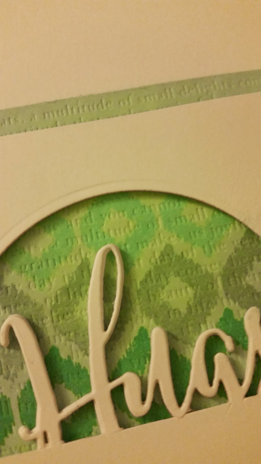
I took a cursive Hugs die and a circle die and did the partial die cutting on a Recollections 110lb white card front.  I also die cut four more Hugs die cuts to pop it up and add some dimension combined with foam tape.
I stamped progressively darker colours using the Irresistible Ikat set and then added some Text Impressions dry embossing with one of the PTI impression plates - love those to add a little extra somethin' somethin' ... :)
 Here you can see some of the texture and die cutting up close:
Inside I used the ampersand from Bountiful Banners and the Easter wishes stamp from Mega Mixed Messages - so many useful sentiments in that jam packed set!
Hope you have fun with this week's challenge!!

Check out my sale of crafty items - stamps, an ink pad and some other assorted items!! Oh, and I bought two of the Hero Arts ombre ink pads (mint to green), so if anyone is interested in buying one still sealed, just leave your email and info in a comment!!


Thursday, September 4, 2014

Luxe Smiles

I was inspired by the Papertrey design team revisiting Harvest Berries so I decided to create another card with the Luxe Letterpress Market Kit from Papertrey.  I used the impression plate for the front panel to add some texture.  
It left me with a window so I decided to mask it off and add some Harvest Berries images and a sentiment from Natural Beauties.
I used Fresh Ink in Provincial Gray and Sugar with the sentiment in Charcoal.  I really like the look of these colours together - very calming.
I popped up the front panel (all Recollections 110lb cardstock) with some foam dots and that's it!

Sunday, June 1, 2014

PTI Make it Monday: Debossing Stamped Messages

This week, over at Papertrey Ink, it's all about debossed stamped images.  I made two cards using this method.  The first one is for a forum friend, Karen, who has gone through a tough time lately.  I wanted to make her a card to let her know we are thinking about her ...
I stamped and debossed the butterflies from Happy Trail and then added vellum die cuts and used my Wink of Stella pen for some shimmer.  I stamped a sentiment from Lovely Layers and that's it!
Here you can see some of the shimmer and then Colorbox Frost White stamped images below, debossed.
I added a white panel to the inside of the card to write a message.  Karen, hope you like it!  Know we are all cheering you on! <3 a="" and="" are="" board="" check="" e="" for="" gorgeous="" grateful="" href="http://karensrainbowgarden.blogspot.ca/2014/06/catching-up-card.html" lease="" minute="" nbsp="" on="" out="" positive="" presence="" spirit="" take="" target="_blank" the="" to="" work="" your="">her latest stunning card
... I just love it!
My second take on this challenge used the Hello die and stamp:
 The stamp turns out to be larger than the die but I went with it anyhow ... :)
 Sentiment from Little Bitty Bird as well as the felt die cut.

Well, that's it ... hope you had fun with this challenge; I know I did! :)

Saturday, January 25, 2014

PTI January Blog Hop - Pretty in pink!

Blog-hop-logo

This month, Papertrey has challenged us to use pink in our creations for the blog hop:
The-Challenge
Now, I don't tend to use a lot of pink but I do have the supplies for pink creations so I went to town using fuschias, pinks and deeper reds ...
I used the Chevron Cover plate as a stencil and sponged a variety of Fresh ink colours onto some LCI woodgrain cardstock.  I then added a vellum layer for the name 'Salel' for a colleague's new baby with some glitter alpha stickers.
 I tied some silver twine to the top and added a baby charm on the inside (click for a larger image).

This nex card was a simple one with some Pink Paislee chipboard shapes that I sponged with pink ink (Brilliance pearlescent pink) and Fresh ink slate ink.  I added a sentiment from PTI's Lovely Layers with Versafine Onyx Black.
 The card base is Recollections metallic silver - pink and silver always look so good together! :)
I used my Envelope Punch Board to make a patterned paper envelope which you can see just peeking out from underneath the card.

My next card is a simple light gray and pink one with some texture and dimension:
I used the In Bloom impression plate on a piece of pink card stock and used the 'hello' die for a negative die cut.  I kept the little pieces from the 'e' and 'o' and popped up the pink panel using foam dots.  The card base is a light gray card stock from Staples.
I picked up some Kate Spade tape from Indigo and thought it would look good with the gray and pink combo.  I added it to the edges on the top and bottom before stamping an ombre effect using three colours.
 Here you can see the light pink a little bit better:
I kept it one layer so it would be easy to mail even though I usually like to add more layers or dimension ... I even stopped myself from adding sequins - what do you think, should I add some after the fact?

Okay, last card on this pink-athon ....
A very simple one with Fresh ink fuschia stamped Stitches and Swirls from PTI.  I added a vellum sentiment using Fresh slate ink with an Embroidered Blooms 'thanks so much'.
I added some baby pink pearlescent Stickles in the centre of some of the flowers for a little something extra.

Hope you had fun using pink on your creations today!

Check out my crafty sale if you like:
http://cardsbycara.blogspot.ca/2013/06/crafty-sale.html


Saturday, August 24, 2013

SAF 2013: Rolled Dough Designs

I picked up some Delight Paper Clay after going out for dinner last night to try today's technique using this product.  It is fast drying and super light which makes it perfect for cards.  I was going to use my Damask Snowflake die to make an ornament but went in a totally different direction.
I used the lower case alpha dies to die cut an 'x' for my nephew, Xavier.  I stamped it with the herringbone pattern from the Mat Stack collection 
I added it to a Mat Stack stamped die cut using Fresh Turquoise ink and an Enchanted Evening mat.  I put on some foam dots adhered behind before adhering it to a Staples grey card stock base that I impressed with the Herringbone impression plate.  Love the texture that adds!         
I stamped an envelope with some trucks and cards from a baby boy Fiskars set - he just adores any mode of transport whether it be trains, trucks, vans .... you name it, he loves it! :-)     

My next card up is a birthday card using some more paper clay.  For this one, I die cut a Notched Flower which I stamped with the BB: Newsprint stamps in French Lavender Fresh ink.
I matted a piece of PTI patterned paper (a purple graph background) to my Staples grey card base and added a Double Ended Banner die cut in Smokey Shadow.
I added a Wonderful Words: Birthday die cut using cork and stamped a coordinating envelope with Modern Wood Mats - such a stylish set!!

I also made a card for my cousin - she loves pastel colours so I went with a muted hues:
I used a piece of Studio Calico's Snippets 6x6 paper pad - love those polka dots!  I adhered that to my card base and then added some silver twine and a woodgrain embossed Beautiful Blooms II die cut in Aqua Mist.  I added my ubiquitous foam dots to the die cut before adding the Postmarks stamped 'k' to the front.
So what have you created with paper clay?  Share your links and tips below! :)

-------
If you are looking for some crafty supplies, check out my sale page here to see if anything catches your eye.  I've got grid journaling cards, an impression plate and some stamps! 
------
Supplies:
'x' is for Xavier
Paper: PTI Enchanted Evening, Staples grey
Ink: Fresh Sky Blue, Turquoise
Stamps: PTI Mat Stack collection
Misc: Delight paper clay; PTI Herringbone impression plate, lower case alpha die, mat stack and layerz, foam dots

birthday
Paper: Staples grey, PTI patterned graph paper

Ink: Fresh French Lavender
Stamps: PTI BB: Newsprint
Misc: Delight paper clay, cork; PTI notched flower die, PTI double ended banner die, PTI Wonderful Words: birthday die; foam dots

'k' is not for cousin
Paper: PTI Aqua Mist, Studio Calico Snippets 6x6 paper pad
Ink: Fresh Fuschia
Stamps: PTI BB: Postmarks
Misc: Delight paper clay; PTI Woodgrain impression plate, lower case alpha die, foam dots, silver twine