Sunday, April 14, 2013

PTI Make it Monday #111: Watercoloring Embossed Images - cover plate card

This week's Make it Monday over at Papertrey ink involves watercolouring embossed images.  The great thing about using embossing powder before watercolouring is that the embossing powder helps the wet colours stay within the lines - a little more fool proof!  :)

Here's Heather Nichols' video covering the technique as she makes a beautiful card:
I decided to grab my hexagon cover plate to make a the front of the card - it almost looks like a lattice.  And I challenged myself to NOT use a sentiment, despite how much I wanted to! :)  I attached the front aqua mist panel to a thin flap of the white card base using some Tombo Mono Multi glue - this stuff is great for thin beads of glue.
I stamped the ikat diamonds in Fresh sugar ink on a piece of Smokey Shadow on a Sending You die cut.  I stamped and embossed the In Bloom flower using Versamark and Zing embossing powder.  Then I added a watercoloured flower (In Bloom) using a variety of  Shimmer Paints.  A little sprinkling of foam dots behind add a little dimension to the front.
Hard to capture the sheen of these paints but in person, it is remarkable.  I love using these rather than regular watercolours for that very reason.

Here is another shot showing a better idea of the front panel:
I might stamp a sentiment behind the Sending You die cut when I decide who it's going to and I will definitely be writing the message on the back of the card so it doesn't show through ... or I could write the message right where the Sending You die cut covers the white base.  We'll see ... :-)
Thank you to Betsy Veldman for this idea of using the cover plate 'bare' like this - she did a card (with more layers and more of the cover plate covered) but I pinned it a while back to use it as a jumping off point.
Supplies:
Paper: PTI Aqua Mist & Smokey Shadow, Staples 110lb white,
Stamps: PTI Irresistible Ikat, In Bloom
Ink: Fresh sugar, Versamark
Misc: Tombo Mono Multi glue, Zing embossing powder, Impress Shimmer Paints, foam dots, PTI Hexagon cover plate 


Sunday, April 7, 2013

PTI Make it Monday #110: Collage Elements

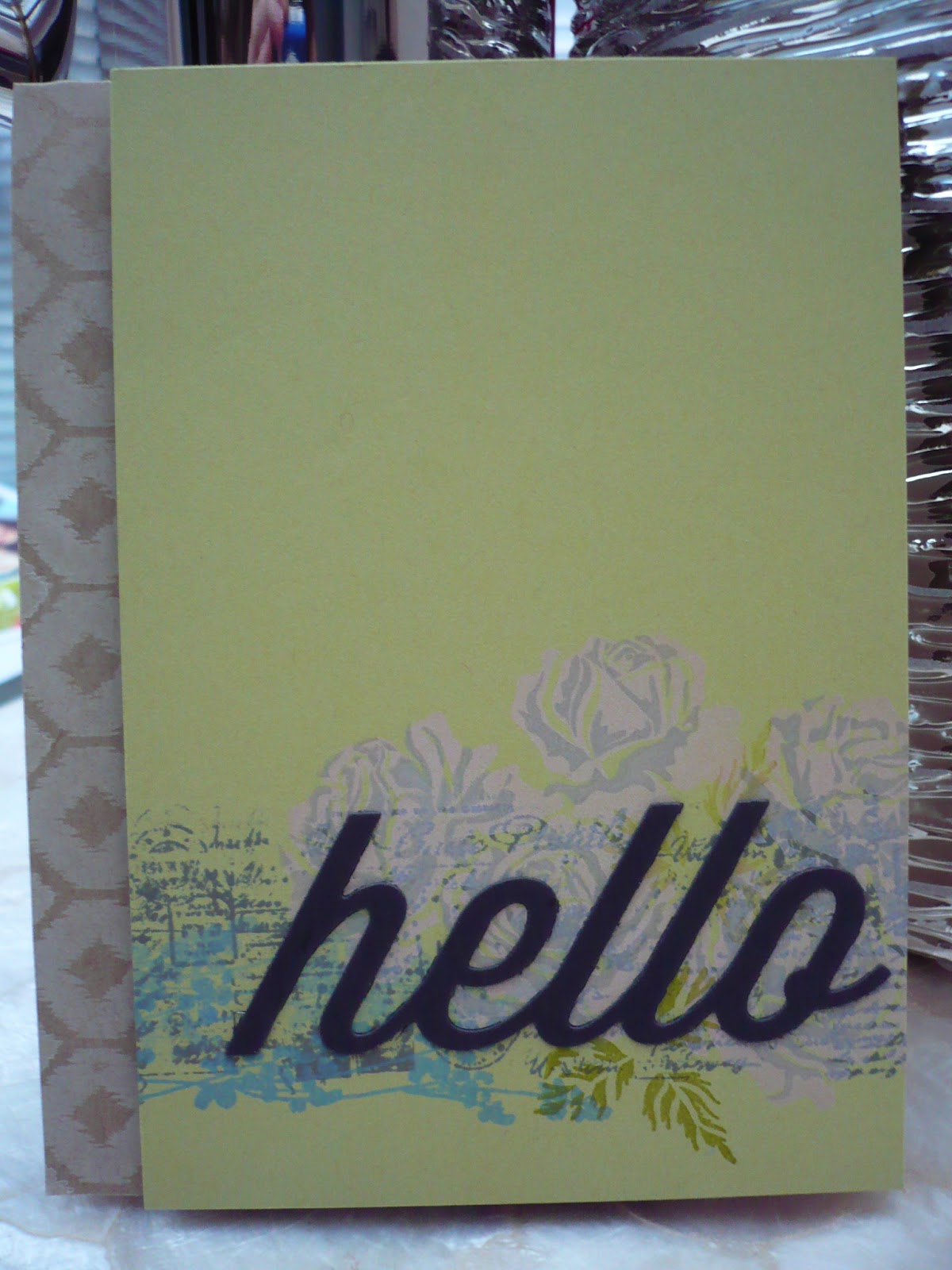
This week, the uber talented Dawn McVey showed us how to make a card using layers of stamping in a collage style.  This is not my usual but I decided to give it a go to take myself out of my element.
I used a kraft card base and stamped the Irresistible Ikat hexagon pattern along the left hand side in PTI Vintage Cream ink.  Then I got started on the spring moss panel.  I layered Postmarks background panel with one of the Life flowers and the Sweet Life flowers.
I added a Smokey Shadow die cut from the Wonderful Words collection over top.  I love the fact that PTI is releasing a new word each month!
 I popped the Spring Moss panel up on foam dots to add some dimension.  Can't stop using foam dots! :0

Supplies:
Paper: PTI Kraft, Smokey Shadow, Kraft
Ink: Fresh slate, provincial gray, silver lilac, steel blue, sugar, tuscan olive; PTI vintage cream
Stamps: BB: Postmarks, Sweet Life, Life, Irresistible Ikat
Misc: foam dots, PTI Wonderful Words: hello die

Festive Friday - colour challenge: Aqua, Blush and Gold

The fabulous Meredith MacRitchie and her amazing DT over at Festive Friday http://festivefriday.blogspot.ca/ have challenged us to use the above colours for a holiday card.  I have been remiss in posting my creations and made sure to get mine in on time this time.

These are the two I made for the Rustic challenge but didn't get a chance to submit:

I'm not very good at rustic and it's not my usual style so I just threw in some cork and kraft on the first card and rustic cream card stock on a vellum card base on the second.  Kinda sorta not really rustic ... :)  Anyhoo, just wanted Mer to know the thought was there! <3 br="">

So, luckily I did have a chance to create (and photograph! and post!) two cards for this colour challenge:
I used my Avery Elle Ikat set with Fresh sugar ink on Aqua Mist card stock and added the Think Big sentiment in Fuschia and clear embossed it.
Some sparkly ribbon along the side and gold embossed wood veeneer stars and that's it!  (To heat emboss the wood, just pounce them in Versamark and then shake embossing powder over top before heating it up.)

** edited to add - this card was given a shout out on the Festive Friday blog: thanks so much for the sweet words! 

For my next card, I went with a rustic white card base and used the Herringbone background stamp in Brilliance Galaxy Gold ink.  The shine in person is awesome with that ink!  Do you have a favourite gold that you use?  Which one?
I added a layer of Aqua Mist cardstock and stamped the stitches in Versamark repeatedly for some subtle watermarking and stamped the Think Big sentiment with Versamark before using some Zing embossing powder in gold.
I added Fresh sugar stamped chevrons to the poinsettia die cuts and added rock candy glitter to the top layer before topping it with a gold pearl.

Supplies:
Paper: PTI Aqua Mist
Ink: Fresh sugar, fuschia; Versamark
Stamps: Avery Elle Ikat, PTI Think Big
Misc: Studio Calico star wood veneers, Zing embossing powder: gold and clear, sparkly pink ribbon from stash
Paper: PTI Rustic White, Aqua Mist, Staples 110lb white
Ink: Versamark, Fresh sugar, Brilliance Galaxy Gold
Stamps: PTI Think Big, BB: Chevrons, BB: Herringbone, Stitches
Misc: Zing embossing powder: gold, gold pearl


Monday, March 25, 2013

Papertrey Ink Blog Hop - Sequins: with love

Blog-hop-logo
This month's challenge over at Papertrey Ink is to use sequins in projects.
The-Challenge
  March-blog-hop-inspiration


I had a lot of fun making cards with sequins and actually mailed off an Easter card with them but didn't have a chance to photograph it!  Sequins add a little interest and texture to a card and I am loving them!  I used to always use them on one of my holiday card designs - a red sequin worked perfectly for Rudolph's nose! :)
I finally bought the notched flower dies - at first I thought I didn't need them but then decided they would be a good way to use up some patterned paper.  I took some Amy Tangerine paper I had and cut the flowers, edging them with the Vintage Tea dye ink.
I added some foam tape (I bought a big roll at the dollar store that has been serving me well) to the layers and some gold sequins on top for the centre.  A sentiment from Mini Blooms stamped in Vintage Cream ink completed the card.

Have you used any sequins lately?  What are your favourite colours?

Supplies:
Paper: PTI Smokey Shadow, Amy Tangerine patterned paper
Stamps: PTI Mini Blooms
Ink: PTI Vintage Tea dye, Vintage Cream
Misc: foam tape roll, gold sequins

Papertrey Ink Blog Hop - Sequins: Birthday wishes

Blog-hop-logo
This month's challenge over at Papertrey Ink is to use sequins in projects.
The-Challenge
  March-blog-hop-inspiration


I took out the fun graphic set Lovely Layers and stamped three times - twice with Fresh Merlot ink and once with Birch, a nice kraft shade.  I added gold sequins to the deep red medallions and a black one to the kraft coloured one. 
Then I added a sentiment from the Irresistible Ikat set - I bought that one almost as much for the cool font combo as for the images! :)
I love the fact that sequins are relatively flat so they make for easily mailable cards and since I send a lot of cards, mailability is pretty important!

So, have you made any cards with sequins lately?  How do you use them?

Supplies:
Paper: Staples 110lb white
Stamps: PTI Lovely Layers, Irresistible Ikat
Ink: Fresh Merlot, Kraft; Memento Espresso Truffle
Misc: gold and black sequins, Glossy Accents

Tuesday, February 12, 2013

PTI Anniversary Watercolour Challenge - Happy Mother's Day

For my next card answering the watercolouring challenge over at Papertrey, I decided to embrace the imperfection and just have some fun with my watercolours.  I painted a bunch of circles on a piece of watercolour paper and blended them in.  My Niji pearlescent watercolours even has a gold colour so I used that too for little shine ...
I mounted this to a white card base and then layered vellum overtop to mute the colours after heat setting the watercoloured piece to ensure it was completely dry.  I was going to do some heat embossing on the vellum but since this can warp the cardstock a bit, I decided not to.  I wanted to keep it as smooth and flat against the base as possible.
I added the sentiment pieces from PTI's gorgeous anniversary set from last year stamping them all with black StazOn Jet Black ink for a bold look that wouldn't smear.

A very clean and simple card but this will be used for Mother's Day either in a card set or for my own mother ... we will see what I decide! :)

Here's another card I did a while back using these same watercolours - this one shows the pearlescence effect of them:


Supplies:
Paper: Staples 110lb white, watercolour paper, Gartner's vellum
Stamps: PTI Pretty Peonies
Ink: StazOn Jet Black
Misc: Niji pearlescent watercolours, aqua pen

PTI Anniversary Watercolour Challenge - Hello

For this year's anniversary festivities, Papertrey has been doing a whole bunch of fun challenges.  I've been pretty busy so haven't been able to take part until now ... I thought I would try my hand at some watercolouring.
For my first card, I decided to try using Harvest Berries with some heat embossing and then colour in the leaves. So much for that plan ....
The little lines and holes weren't large enough for the colour to stick and show up so after getting a little frustrated with my original idea, I just watercoloured the whole thing with various shades of green pearlescent watercolours and then added some Studio Calico shine mist.  Embossed resist instead ...
I added a bold sentiment from Think Big Favourites and mounted the panel with some low profile foam dots to add it to a Spring Moss card base.

The pearlescent watercolours combined with the Studio Calico shine mist adds a nice subtle sheen to the layer but my photo doesn't capture that very well.  Just trust me, ok?! :)  It's got some sheen and the green is more visible ...  really, I promise!

Supplies:
Paper: PTI Spring Moss, Staples 110lb white, watercolour paper
Stamps: PTI Harvest Berries, Think Big Favourites
Ink: Memento Tuxedo Black, Versamark
Misc: Zing white embossing powder, foam dots, Niji pearlescent watercolours, Studio Calico shine mist

Monday, February 11, 2013

Festive Friday #1 - red, white and silver

The fabulous Meredith MacRitchie has begun a blog entitled Festive Friday to help us create holiday cards all through the year.  The challenge is to use red, white and silver.
When I saw this gorgeous colour combo, I puchased some silver embossing powder tout de suite with the idea that I would get some cards made right away ... Well, days later and I still hadn't had a chance to make any cards for this challenge.  I finally had a moment and got inky. 

For my first card, I grabbed some silver shimmer cardstock I purchased a while back with an M's coupon and made a clean and simple card.
Of course, by the time I ever get to take photos, it is dark so you'll have to excuse the bad lighting ... no light box for me!  I used a die cut from PTI's Happy Trails and smooshed it into my Fresh red currant ink pad to get the colour I wanted.
I used Versamark and some white embossing powder to stamp Technique Tuesday's Peace Joy and Love stamp set.  White embossing on silver always has such a cool look ...
Some low profile foam dots on the dove and I mounted the silver panel to a white card base leaving some white space peeking out.

My next card used silver heat embossed leaves (PTI's Mistletoe and Holly) with a white heat embossed sentiment from PTI's Think Big Favorites.
I mounted it on a white card base and added some burgundy and silver Stickles.  Gotta love the bling that Stickles bring! :)
The shine of the silver embossing is so pretty against the Scarlet Jewel cardstock - that embossing really pops on dark cardstock.
I am so sad that the Think Big Favourites series has come to an end - I just love larger more bold sentiments. 

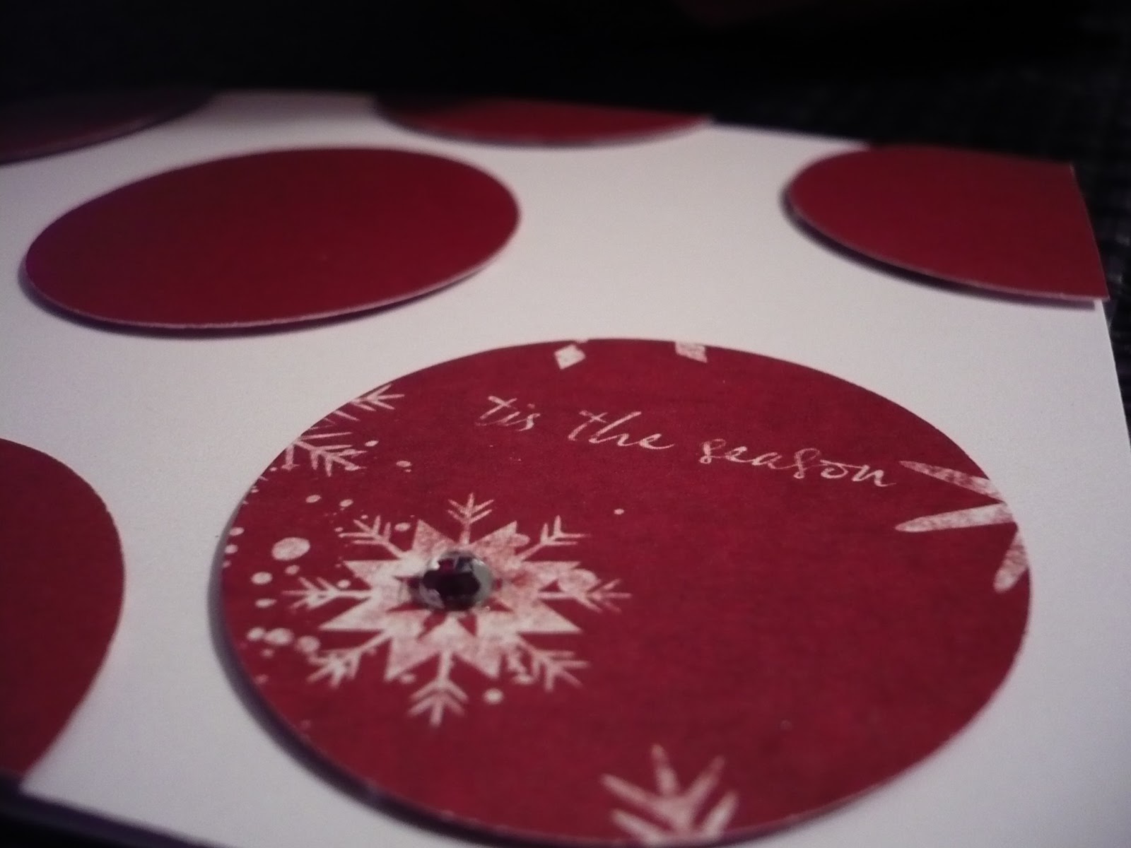
My next card made good use of my 1 3/4" circle punch and some holiday patterned cardstock.  I punched a bunch of circles and mounted them to a white card base.  I used the 'B' side of the cardstock for all but one of the circles and the patterned one (the 'A' side) had the perfect sentiment for the card - 'tis the season. Now that I'm looking at that one circle, I think it could move over a bit more to the right ... oh, well!  Gonna let it go for now and maybe move it a bit tomorrow.
I added a silver rhinestone to the centre of the snowflake on this one for a little bling.  Not sure if you can tell, but all the circles are mounted with low profile foam dots for a little extra dimension.
 
When I was playing with my silver embossing powder and starting out, I made this card and decided to add the red stars ... bad idea on my part but I'll show you the card anyhow ...  I just love that frame from Pretty Peonies ... why did I have to add those stars?!
Well, Meredith, congratulations on your fabulous beginning to your challenge blog - I am so proud of you! <3 br="">

Supplies:

peace on earth
Paper: Staples 110lb white, Recollections silver shimmer
Stamps: Technique Tuesday Peace, Love and Joy
Ink: Versamark, Fresh red currant
Misc: white  Zing embossing powder, foam dots


holiday wishes
Paper: Staples 110lb white, PTI Scarlet Jewel
Stamps: PTI Mistletoe and Holly, Think Big Favorites
Ink: Versamark
Misc: silver and white  Zing embossing powder, Stickles (diamond, burgundy), foam dots


tis the season
Paper: Staples 110lb white, Christmas patterned paper
Misc: 1 3/4 circle punch, silver rhinestone, foam dots


Thursday, February 7, 2013

Clean and Simple II: Glitterama Day 9

Well, they had me as soon as I saw the word glitter - say no more, I was willing to give it a go!  In certain instances, you just gotta have a little bling .... right?
The picture doesn't give a very good idea of the glittery effect but maybe it's because I used watercolour paper which isn't very smooth to begin with.  I swiped the paper with Distress Stains (bundled sage and broken china) and used an aqua pen to create an ombre effect from dark to light.
I stamped the sentiment from Studio Calico Snap On and then heat set the piece of cardstock very well before adding Sticky Stuff powder and then layering Rock Candy glitter and reheating to set.
*********************
I wanted to make one more card with Distress Stains using broken china and a metallic pewter as well.  I didn't add glitter to this one but mounted it on a light grey card base and added a dragonfly from PTI's Happy Trails and a silver embossed sentiment from the same stamp set. 
 I mounted the sentiment panel to the base with foam dots.
The pewter distress stain adds some nice shine and sparkle in person - it was a good purchase!