Showing posts with label masking. Show all posts

Tuesday, August 25, 2015

Papertrey August 2015 blog hop

What gorgeous colours for this month's blog hop!!  I was happy to get my fingers all inky - I have been away most of the summer and haven't had a chance to make any cards.

Here is the inspiration pic:
I experimented with watercolouring a Bloomers die but it didn't stand out enough so redid the diecut with a simpler design.  Here's what I finally came up with:
I used my MISTI stamping tool to get solid impressions and a thick plastic quilting sheet I had cut down to push the card stock against.
I used a variety of Avery Elle and Fresh pigment inks to stamp the Watercolor Wonder stripes - I just love the saturation of pigment inks!  From top to bottom - Red Currant, Fuschia, Pixie, Peach.
I added some Fresh Sugar ink to the edges of the Bloomers die cut and added some Soft Stone accents to the flower before adding a Versafine Onyx Black Scripted stamped sentiment (now, that's a mouthful!)  I used some foam tape to add dimension to the die cut and show off the placement of the sentiment on both the card base and Bloomers flower.

And here's my other creation using the same colours and Ashley's Make it Monday technique of masking the sentiment:

-----
If you have a moment, check out my gently used item sale *here*.  I have stamps, ink pads and other things too ...

Thursday, September 4, 2014

Luxe Smiles

I was inspired by the Papertrey design team revisiting Harvest Berries so I decided to create another card with the Luxe Letterpress Market Kit from Papertrey.  I used the impression plate for the front panel to add some texture.  
It left me with a window so I decided to mask it off and add some Harvest Berries images and a sentiment from Natural Beauties.
I used Fresh Ink in Provincial Gray and Sugar with the sentiment in Charcoal.  I really like the look of these colours together - very calming.
I popped up the front panel (all Recollections 110lb cardstock) with some foam dots and that's it!

Thursday, July 25, 2013

Papertrey July Blog Hop colour combo #3 - fruits of summer

Another great colour combo over at Papertrey:
I took a SSS piestra die and made a mask with some Eclipse paper and sponged Fresh merlot, red currant, mango, tuscan olive and sicilian blue.
I added the sentiment with some black ink (Mini Blooms) and that's it!  A very simple one layer card.
Oh - and if you need any new supplies, check out my sale page here for some crafty items I have on sale now ... if you need some new supplies, see if any of my items interest you.

Thursday, April 25, 2013

PTI April Blog Hop: Tilted - my smiles begin with you


Blog-hop-logo

The-Challenge
Blog-hop-inspiration


From PTI's website: It only takes a little *something* to take a project from ho-hum to amazing!  Even something as small as tilting your images or sentiments at an angle can have a huge impact.  This month we are challenging you to create a project that features something tilted.  Position a frame at an angle, tilt your text, add a background strip diagonally, create a border that has an incline, slant a sentiment block, the sky is truly the limit!  We look forward to seeing your projects later this month! 
I wanted to do some masking on an angle for a card as it is such a simple but effective technique.  I bought a roll of Eclipse masking paper from Impress Rubber Stamps and it works so well!  If you don’t have masking paper, you can use Post It label tape from the office supply store or even larger post its!  The trick is to try and stamp right on to the masking paper so that the masked area shows up well when you take it off.  Also the thinner the paper, the better as it will then stamp closest to the paper rather than leaving a gap.  Since I can’t cut on a straight line for the life of me, I used my trimmer instead.   


I started out stamping the larger flower from Papertrey’s Irresistible Ikat in PTI Vintage Cream.  I then layered Fresh ink’s Pear colour with the smaller flower from the same set.  I removed the masking paper and added a sentiment in Fresh ink in slate but after realizing it wasn’t quite dark enough to show up well, I layered it with navy and stamped slightly off for a shadowed effect.


Supplies:
Paper: PTI Aqua Mist
Stamps: PTI Natural Beauties (sentiment), Irresistible Ikat (images)
Ink:  Fresh navy and slate, PTI Vintage Cream
Misc: Eclipse masking paper

Thursday, February 7, 2013

Clean and Simple II - more masking from day 2

 So I tried the double masking from the other day over at the online class Clean and Simple II.  This is inspiring me to make cards in different ways and try some techniques for the first time and revisit others that I haven't done in a while. 
 I masked using an Angled Labels die (PTI) to make a mask from Eclipse paper and then sponged over some pale blue ink (Fresh sky blue).  I used the reverse of the mask to stamp the Studio Calico grid pattern background stamp using some Fresh slate ink.
Then I stamped Edward's name using Alpha Dots from Paper Smooches to personalize the card for little E who is a new arrival to one of my colleagues.  I used a Fiskars Baby Boy set for 'baby' and stamped it all using the nice and dark ink ( Versafine Black Onyx).
I used some stamps from the Fiskars set on the inside of the card with Versafine Black Onyx and Fresh red currant.

I like making my cards as personalized as possible and what is more personal than the baby's name itself! :)

Supplies:
Paper: Staples 110lb white
Ink: Versafine Black Onyx; Fresh sky blue, red currant, slate
Stamps: Fiskars Baby Boy, Paper Smooches Alpha Dot, Studio Calico grid pattern background stamp
Misc: Eclipse masking paper


Thursday, January 31, 2013

Clean and Simple: Day 2 - thank you

Another day of the fabulous card making class, Clean and Simple II:
Not sure but this might be more day one than day two but oh well ... I did some masking with an Angled Labels mask I made from acetate and a PTI die. I sponged some Colorbox Robin's Egg ink and then layered Hero Arts Studio Calico lattice background stamp with some Fresh ink in Steel Blue.  I stamped an arrow from Studio Calico Snap On's stamp set with Hero Arts' Cup o' Joe ink - what awesome coverage these mid tone inks have!!  Now that I have some, I see what all the fuss was about. :)

I added the sentiment from  Fabulous by Technique Tuesday using the nice and opaque Versafine Black Onyx. For a final touch, I decided to add some texture using PTI's Linen impression plate.  This is a great stand by!


So have you tried any masking?  How has it gone for you?

Paper: Staples 110lb white
Stamps:  Studio Calico Snap OnFabulous by Technique TuesdayHero Arts Studio Calico lattice background
Inks: Versafine Black OnyxHero Arts' Cup o' Joe, Colorbox Robin's Egg, Fresh ink - Steel Blue
Misc: acetate, PTI Angled Labels die, PTI Linen impression plate

Wednesday, January 30, 2013

Clean and Simple - Day 1: Love you more

Whoo hoo - clean and simple, here we come!
So I decided to try my hand at masking after I was inspired by the talented Jennifer McGuire ... I cut out some cloud masks using my Wplus9 clouds with some acetate for reusable masks.  I sponged Fresh Ink: Sicilian Blue and Sky Blue and Colorbox Robin's Egg with a dry baby wipe since I couldn't find my Distress Ink sponges ... :) Well, it worked and that's what's important, right?
I used the  Studio Calico Snap On stamp set for the sentiment and since I wanted a really opaque black, Versafine Black Onyx was my ink of choice.  This is great for a really solid sentiment that is super sharp - it works every time!

I decided that the card needed a little something so I added some blue sparkly Stickles in the bottom corner.

Supplies:
Paper: Staples 110lb white
Ink: Versafine Black Onyx' Fresh ink: Sky Blue, Sicilian Blue; Colorbox Robin's Egg
Stamps: Studio Calico Snap On
Misc: acetate, Stickles, Wplus9 cloud dies


Saturday, June 23, 2012

Pretty in Pink and another bordered sentiments attempt

I've got another card for the CAS-ual Fridays challenge, Pretty in Pink.  Why don't you play along too?  You could win a $20 gift certificate here:
I do not usually gravitate towards pink but this is a fun way for me to stretch my creative muscles ... that is, if I have any! :)

My mom gave me some paint chips from Sherwin Williams that she got and I took a bunch of the pink ones to use for this challenge.  I used my Happy Trails die to cut out the butterflies.  I popped them up on foam dots and then stamped the Fillable Frames sentiment in Jenni Bowlin fountain pen ink.  Super simple.
 
My next card combined the Make it Monday challenge (Bordered Sentiments) from Papertrey Ink and some pink shades for CAS-ual Fridays.
I stamped BB: Newsprint in Versamagic Pixie Dust and then layered Embellishments' swirls in Jenni Bowlin chewing gum over top.
I used Sassafras Stitchery for some faux stitching as my border and Hero Arts Made with Love for the sentiment.  I love these sentiments because they're nice and big, just like PTI's Think Big series.

Supplies:
Paper: PTI Vintage White, Sherwin Williams paint chips
Ink:  Jenni Bowlin fountain pen
Stamps: PTI Fillable Frames
Misc: foam dots, PTI Happy Trails die (butterfly) 
Paper: PTI Vintage White
Inks: Fresh Inks slate, Versamagic Pixie Dust, Jenni Bowlin chewing gum
Stamps: PTI BB: Newsprint, Embellishments; Hero Arts Made with Love
; Sassafras Stitchery
Misc: Eclipse masking paper


Papertrey Make it Monday #71 - Bordered Sentiments

This week, the talented Betsy showed us how to make bordered sentiments.  It's a fun and easy masking technique:

I decided to use the colour combination from Moxie Fab's Tuesday Trigger a while back as the jumping off point of my first card:
I used some Fresh inks and imperfectly inked them to give a more rugged feel to the card.
I used my beloved but not used lately BB: Vines stamp to do the background and then used Faux Ribbon as my line ... You see, I'm not so good at drawing my own lines, even with a ruler! :)  I then selectively inked the Think Big sentiment with two different colours used on the vines as well. 

Supplies:
Paper: PTI Vintage Cream
Stamps: PTI BB: Vines, Think Big sentiments, Faux Ribbon
Ink: Fresh navy, slate, maroon
Misc: Eclipse masking paper

Sunday, May 27, 2012

Card Creations - Damask and Brocade Challenge


Here's the challenge issued over at Moxie Fab:
Create a paper crafted project (card, gift bag, tag, layout, home decor item, mini-book cover, etc.) that incorporates damask or brocade in an innovative way.


Well, I do adore damask and my Papertrey set hasn't seen much use lately so I decided to give it a workout.

I used my Pretty Peonies die to make a mask and stamped the damask all over the card with Vintage Cream from PTI.
Then I stamped the frame in silver lilac ink and the sentiment with steel blue.  A simple one layer card, easy for mailing.

I decided to make another one using the tag sale die:
I cut the tag sale die cut in spring moss card stock and stamped a Think Big sentiment in black before stamping a large damask in Versamark.  A quick clear layer of embossing powder to add a little more definition and the centre was done.
I stamped the background all over in pear ink but it is really hard to see ... The centre one is stamped in tuscan olive. a A green button with some button twine and the card was done!  I popped the die cut up on foam dots for some dimension.
I decided the card deserved a decorated envelope so I stamped the damask background with pear ink right in the centre.

Supplies:
Paper: PTI kraft
Stamps: PTI Damask Designs, Pretty Peonies
Ink: PTI vintage cream; Fresh silver lilac and steel blue
Misc: Eclipse masking paper


Paper: PTI kraft and spring moss
Stamps: PTI Damask Designs, Think Big
Ink: Versamark, Fresh pear and tuscan olive; Memento tuxedo black
Misc: button from stash, button twine, PTI tag sale die,foam dots, clear embossing powder

Sunday, May 6, 2012

Passion for Papertrey - whatever the weather challenge


Over on A Passion for Papertrey, they have a challenge this week called Whatever the Weather.  I love their blog and try to join their challenges when I can.  They all have great style and I really enjoy their mad card skills!  Plus, I was inspired by the gorgeous weather today - really glorious sunshine.  After going for a walk with a friend along the seawall, I grabbed some of my supplies and got started.  I put on a movie I had recorded in the background (Jennifer Lopez's Back up Plan) and happily stamped away.

Here's my first one, which was actually the last card I made.  Not much stamping at all but the colours are sunny!
I split the Beautiful Butterflies set with someone for the sentiments only.  Gasp, I know!  I just decided I didn't need a whole set of butterflies even though they are truly beautiful. :)  I have a butterfly scene from Tim Holtz and also the gorgeous butterfly from PTI's Happy Trails.  So only the sentiments came home with me.  Oh, and I got this gorgeous patterned paper from the talented Aga in a prize pack she sent me a while back. 
It's Cosmo Cricket's DeLovely and all the patterns and colours are bright, and well ... lovely!  Thanks, Aga, as it has inspired me to make some more bright and fun cards. :)
I used PTI's Limitless Layers to cut the circle and mat behind.  As you can see, there is the sentiment Like a Rainbow, you color my world stamped in Fresh navy ink as I felt black would be too harsh.  I still have a tough time with the American spelling since to my Canadian eyes, it looks like it's not spelled right but what are you gonna do?  I would actually selectively ink and try and add the 'u' but I was going for a quick fun card after all the that masking I did in this next pic...

So here it is, card number two:
Obviously my masking (and sponging) skills need some work but it is a bit more blended in person ... really! :)  Don't believe me, huh?  Well, I decided that even though it's no masterpiece I would post it.  Even if it's shameful ... <----- insert embarrassed emoticon here ...
I originally stamped over each sponged section while masked with a variety of stamps (BB Retro, Text Style, Turning a New Leaf, Polka Dots, In Bloom) but since I used Jenni Bowlin's Malted Millk, it didn't show up enough for my liking.  I like subtle well enough but it was beyond subtle.  So I used my new Market Street Stamps background honeycomb stamp over top in Distress Ink Marmalade.
I just love this sentiment from Modern Wood Mats - it's such a sweet one, isn't it?  Oh, in this closeup you can see the Malted Milk ink peeking through a bit but it just wasn't enough.  I used the Sunshine impression plate inked up for a letterpress technique with the DI's Marmalade as well.

This one is a more literal scene of sun and clouds.
The rays are Faux Ribbon with a Modern Wood Mats sun and I used an inked up Mehndi Medallions impression plate for the letterpress technique on the clouds.
If you look closely, you can see Text Style used as a background on the front panel.  Oh, and Studio Calico grid pattern background stamp was stamped on the card front and just peeks through from behind.

Okay, last one based on this challenge:
I grabbed a piece of Lemon Tart cardstock and used the Sunshine Impression plate on it after stamping the sentiment on the selectively inked Think Big hello and a spelled out Outline Alphabet's sunshine.  When using the impression plates, I have learned that it is always better to stamp first then impress.  I have done it the other way around when I change my plan and it will sometimes work quite well but the best impression of the stamped image is on smooth cardstock.
I stamped the Outline Alphabet stamps in Jenni Bowlin Chicken Feed and the hello in Distress InkMarmalade and you will notice that there is basically no difference.  I thought it might be a nice subtle ombre sort of gradation but nope! :)
-----------------------------
My last one is not for the challenge but had my yellow ink out and thought I would get a start on my graduation cards.  I have eleven advisees graduating this year and always make personalized cards for my students for holidays, end of year and graduation.  This year since they are graduating and (most) have been my advisees for five years, it is extra special.  Our school colours are yellow, grey and blue so I went with yellow and blue for my colour scheme.

I bought a little mini graduation set called Hats Off from Ditto at Michael's for a couple of dollars.  So the hats are from this set and I simply repeated the pattern.
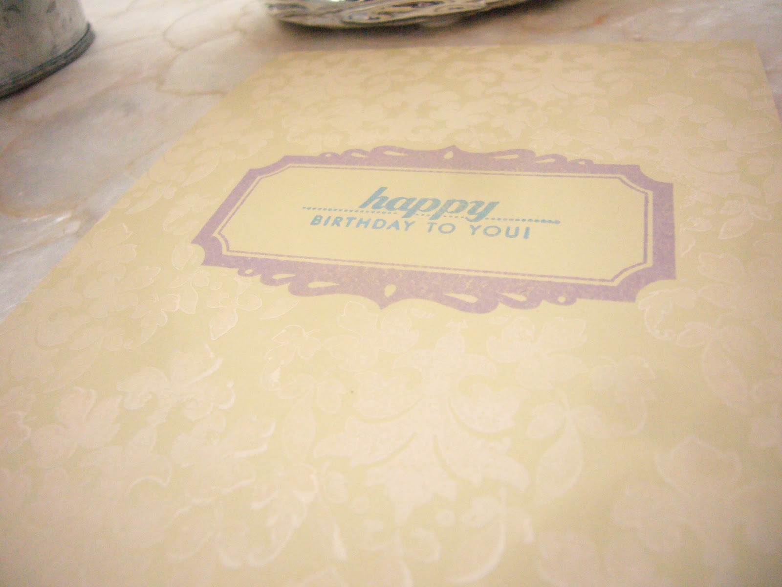
I impressed the circle with the Text Style impression plate after stamping the sentiment from Mega Mixed Messages.
In hindsight, I should've completely dried the Vintage Cream inked sentiment with my heat gun, inked up my Text Style impression plate with Versamark to dry emboss, and then heat emboss in clear but oh well!
This will be a good one for one of the boys in my advisee group.  They all compare their cards so I like to make them as different as possible.

Supplies:
Like a Rainbow
Paper: Staples 110lb white, Cosmo Cricket DeLovely
Stamps: PTI Beautiful Butterflies (sentiment)
Ink: Fresh navy
Misc: PTI Limitless Layers circles, foam dots


 The World is Brighter
Paper: Gina K pure luxury sweet mango, Staples 110lb white
Stamps: Market Street honeycomb background, Modern Wood Mats (sentiment)
Ink: Jenni Bowlin weather vane (sentiment), lemon drop; Distress Ink marmalade
Misc: foam dots
PTI Sunshine impression plate, Eclipse masking paper, Ranger foam blending tools

Hello, Sunshine
Paper:
Stamps:
Ink: Jenni Bowlin chicken feed,Distress Ink marmalade
Misc: PTI Sunshine impression plate

The Sun and Cloud
Paper: Staples 110lb white, PTI Enchanted Evening
Stamps: PTI Text Style, Modern Wood Mats (circle), Faux Ribbon (rays), Studio Calico grid pattern background stamp (background of card base)
Ink: Jenni Bowlin lemon drop, chicken feed, malted milk; PTI Vintage Cream
Misc: foam dots, PTI Mehndi Medallion impression plate


Congrats to the Grad
Paper: PTI Enchanted Evening, Staples 110lb white
Stamps: Ditto Hats Off, PTI Mega Mixed Messages
Ink: Jenni Bowlin lemon drop, PTI Vintage Cream
Misc: 1 3/4" punch, foam dots, PTI Text Style impression plate