Tuesday, April 26, 2011

Sending smiles across the miles

I wanted to brighten someone's day so made this card for them:

I used a PTI impression plate for the base to add some texture and detail, then stamped in layers on a piece of white cardstock.  I used the text style stamp with Distress Ink's Antique Linen in the background, then layered flowers and leaves with Distress Inks and Versamagic chalk inks.  I added the sentiment from Lawn Fawn's Sophie's Sentiments and then some white opal liquid peals for the dots.  Some glitter with a 2 way glue pen and all done!  The white layer is popped up with some foam dots for added dimension.

A more detailed zoom:

My inspiration came from Keva's gorgeous creation and how she had the grass stamped near the bottom.

She is celebrating her blogaversary over on her blog and I thought I'd join in and link my creation.  Happy Blogaversary, Keva! :)

Supplies:
Paper: Gina K Turquoise sea, white from the stash
Stamps: PTI Life, PTI Text Style II, Lawn Fawn's Sophie's Sentiments
Ink: Versamagic Purple Hydrangea, Thatched Straw, Aegean Blue, Spring Peony; Distress Ink Antique Linen + Peeled Paint
Misc: Denami Design Xtra fine glitter, PTI Text Impression Plate, foam dots, 2 way glue pen

A note for you

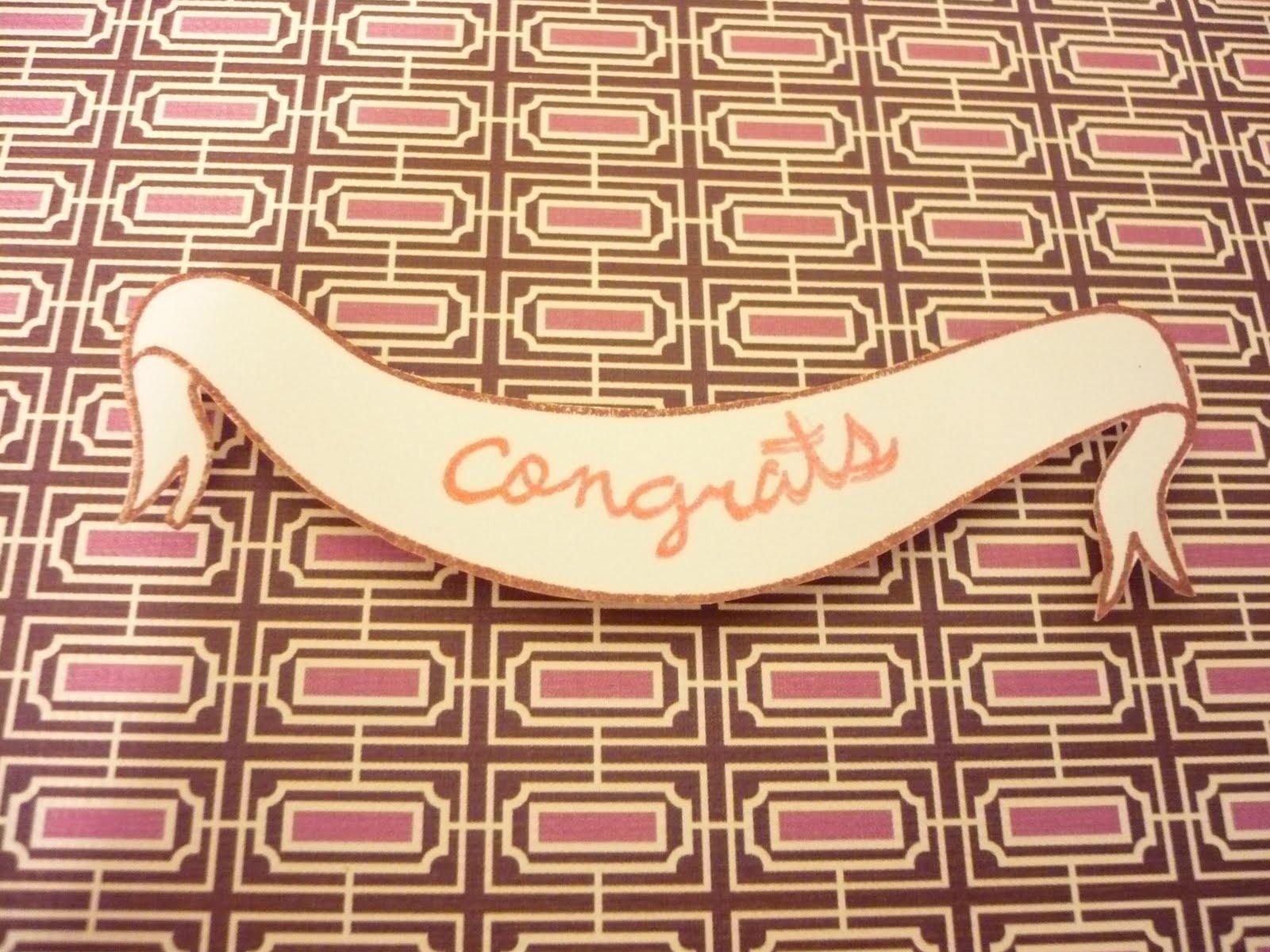
One of my students is having some serious health issues and I thought I would brighten his day with a card.  The news hit me hard and I wanted him to know we are all cheering him on.  I made this simple card to say hello.

I used some Spiced Marmalade Distress Ink on my PTI Giga Guidelines impression plate before running it through.  Just swiping the ink on worked well and added a monochromatic effect to the orange cardstock. I then layered some brown ribbon from M's and a Mat Stack 1 die stamped  with a design in Brilliance Coffee Bean ink popped up on foam dots.  I had to combine two different sentiments from the Mat Stack 4 Collection - a note of thanks and for you for exactly what I wanted as a sentiment.  I made a square 5"x5" card to go in a square petal envelope.  I stamped a Giga Guidelines image in Rocket Red Gold (slightly pearlescent) ink from Brilliance.  This ink works well on coated paper and since the envelope is a coated shimmery cream, this was the perfect choice.  It looks slightly pink in the pic but I promise, it is not! :)

Hope he likes his card and that it makes him smile ...

Supplies:
Paper: Staples cream 110lb, Gina K pure luxury sweet mango, Paper Source 5 1/4" petal envelope
Ink: Distress Ink spiced marmalade, Brilliance rocket red gold and coffee bean
Stamps: Mat Stack 4 Collection (sentiments), Mat Stack 1 Collection die stamp, Giga Guidelines
Misc: Offray brown $1 ribbon, foam dots, PTI Giga Guidelines Impression Plate
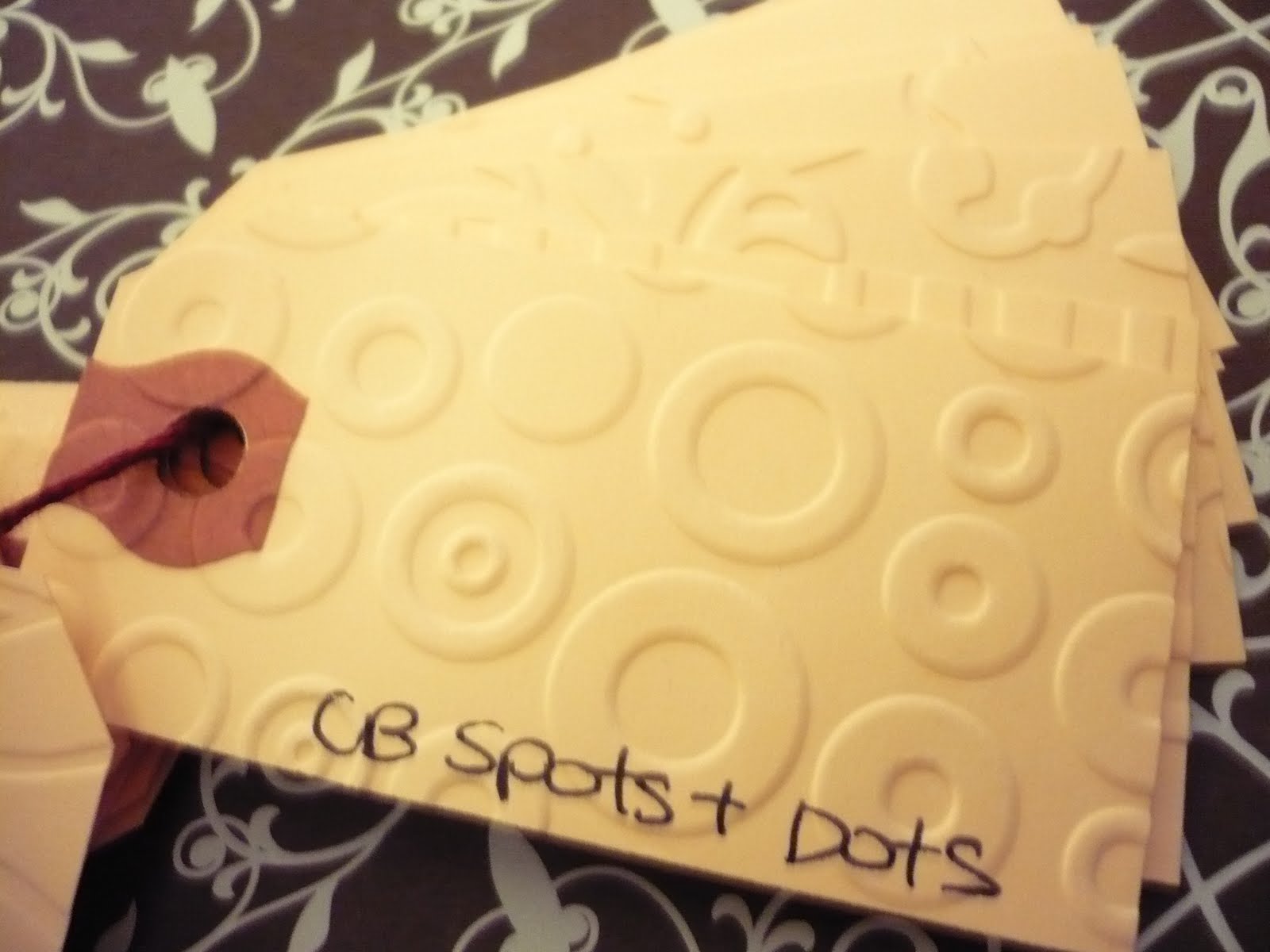
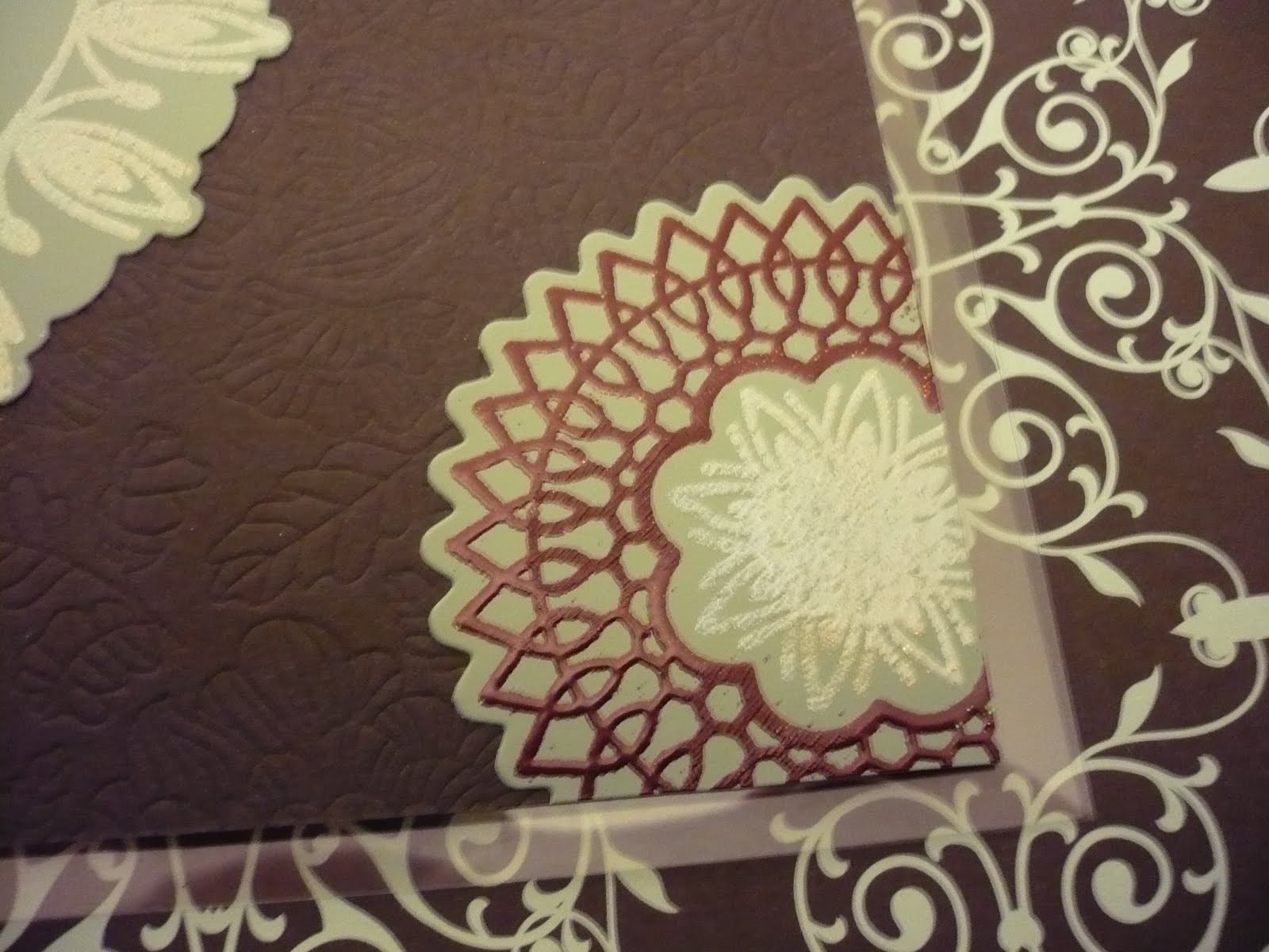
-----------------------------
Technique update:
I did some experimenting with different inks and impression plates and tried at some different effects created by simply swiping the ink on the IP:
Clockwise from top (paper, PTI Impression Plate, ink):
Gina K chocolate cardstock, PTI Diamond IP, Colorbox Frost White Ink
Gina K chocolate cardstock, PTI Moroccan motifs IP, Brilliance Pearlescent Orchid (pink)
Gina K sweet mango, PTI Giga Guidelines IP, Colorbox Frost White Ink
Gina K sweet mango, PTI Sunshine IP, Colorbox Frost White Ink
Gina K chocolate cardstock, PTI In Bloom IP, Colorbox Frost White Ink

Monday, April 25, 2011

Sweet giveaway!

There is a fabulous and generous giveaway over on All Things Paper and Ann has posted some lovely samples using Faber Castell products.  Hop on over there to enter to win ...
Their gelatos look divine ...  They have some really cool sampler packs as well to try out their products.  What fun effects to try out!!

Papertrey Blog Hop - Masculine Theme


Papertrey's Challenge this month:
 This month's blog hop is dedicated to all the boys and men in our lives!  Now's your chance to create Father's Day projects, boy birthday cards and more to build up your stash!  Focus on masculine color schemes, fresh pattern combinations, understated embellishments and unique uses of images you may already have in your stash!
I decided I would make an early Father's day card.  So I got out one of my favourite impression plates from Papertrey and swiped it with Pearlescent blue ink from Brilliance.  I ran it through the Cuttlebug and it added some sheen and definition to the cardstock. 

I layered this chocolate brown cardstock with the sparkly impression on cream cardstock and tied some hemp around three times.  I then cut out a Mat Stack 4 and stamped it with the same pearlescent blue ink using the herringbone stamp from the Mat Stack 4 Collection of stamps.  Love these!  I had to get creative with the sentiments using 'you're the best' from Hero Arts' Everyday Sayings and 'FATHER' from PTI's Mega Mixed Messages in Brilliance Coffee Bean ink.
 In person, the blue on the brown cardstock has some real shimmer.  Hard to pick it up in a picture, especially with my inept skills!
The brown layer is adhered to the cream with pop dots as is the mat stack die cut.

Supplies:
Paper: Staples 110lb cream cardstock, Gina K chocolate
Stamps: PTI Mat Stack 4, PTI Mega Mixed Messages, Hero Arts Everyday Sayings
Ink: Brilliance pearlescent sky blue and coffee bean
Tools/Misc: Pop dots, hemp twine, PTI woodgrain impression plate, Fiskars stamp press

Sunday, April 24, 2011

Happy Spring!

Ok, so I have a confession.  I have a bit of a weakness for fun alphabet sets.  I love them!  You can create your own custom greetings and sentiments and stamp people's names.  This set from Studio G is so cute and so simple.  I love the rounded shape and the fact that they are easy to use.
The other day, my cousin was over and I made a card for her to give her mom for Easter.  I thought this was the perfect time to use my new beloved alpha set.  Here is the card:

I used a Hero Arts background stamp of Cling Dots in a sparkly pink ink (Brilliance Pearlescent Orchid) and then stamped with the small alpha Studio G Ditto stamps  - so cute!  I made this flower with tissue paper and Papertrey's Delightful Doilies smallest die.  I layered them together and stuck it on the card with a glue dot.  Then I decided it still needed something so found this (seldom used) Stampendous bee stamp that I used and then coloured with an aqua pen and some Distress Ink.  VoilĂ !

Supplies:
Paper: Staples 110lb white cardstock, yellow tissue paper
Ink: Brilliance Pearlescent Orchid, Versafine Onyx Black, Distress Ink spiced marmalade
Stamps: Studio G Ditto small alpha, Hero Arts Cling Dots, Stampendous Buzzin' By
Tools/Misc: Delightful Doilies small die, Zots glue dots, aqua brush pen, corner rounder punch

Tuesday, April 19, 2011

Wishing you well

Just made this simple card for a friend's mother who broke her arm ... thought she needed a bright card.

I used a PTI Giga Guidelines Impression Plate and cut out the centre with a fillable frame, then using the stamp set for the frame.  I stamped a sentiment from the Faux Ribbon set taht works perfectly.  I used foam dots to pop the layer off the base a bit.

Supplies:
Paper: Staples 110lb, Gina K orange
Ink: Versamagic Aegean Blue, Green Olive
Stamps: PTI's Faux Ribbon, Fillable Frames #4
Tools:  PTI Giga Guidelines Impression Plate, Fillable Frames #4 die, foam dots

Monday, April 18, 2011

PTI Make it Monday - embossing with dies

Well, I had fun with this technique from Papertrey's Make it Monday series.  Here is the challenge:
Create a project utilizing your take on the challenge.  Your project must use at least one Papertrey product of some kind and emboss your project with dies.
I made two cards using this technique and had fun doing it!
 

I used one of the Delightful Doilies flower dies and embossed the sweet mango cardstock multiply times.  I then stamped different doilies on in pearlescent sky blue and coffee bean Brilliance inks followed by a small star in Versafine Onyx Black.  After that, I stamped the sentiment from Mat Stack 4 Collection.  I cut a strip of chocolate brown cardstock and mounted it on turquoise cardstock.  I will use it with one of my petal fold envelopes that needs a square card.
 A little zoom on the embossing with the flower dies.

Here is my next card close up:


This one was a little more complicated.  As the In Bloom dies are all on one die together, I had to cut out the shapes from cardboard first.  I used an old tea box that is gold on the inside as I can use the die cuts some time for some blingy cards.  I then took these die cuts and used them to emboss the flower and leaf shapes on to the cardstock.  I then stamped the In Bloom images on top in Colorbox Frost White Ink (love how bright this white from Colorbox is!) and added a sentiment from Fillable Frames 6.  I stamped the sentiment on vellum with one of the flowers and then the sentiment is over top.  I had to heat set the ink but it worked out quite well and didn't smudge - phew! :)

Supplies
Card 1
Paper: Sweet Mango, Turquoise Sea and Chocolate Gina K
Stamps: PTI Delightful Doilies, Mat Stack 4 Collection star and sentiment
Ink: Brilliance Coffee Bean, Pearlescent Blue, Versafine Black Onyx
Tools: PTI Delightful Doilies small doily die, corner rounder punch

Card 2
Paper: Turquoise Sea Gina K cardstock, Walmart Kraft notecard
Stamps: PTI In Bloom, Fillable Frames 6 sentiment

Ink: Brilliance Coffee Bean, Colorbox Frost White Ink
Tools: PTI In Bloom dies, scrap cardboard, foam dots, corner rounder punch

Sunday, April 17, 2011

PTI Make it Monday - masking with dies

Well, I was inspired by this week's challenge and did some masking with my PTI dress form die.  I first sponged with Brilliance ink's Platinum Planet and then stamped over that with the mask still there with an image from Asian Fusion.  I used a simple sentiment from Signature Greetings and added some amber coloured bling.


I popped the chocolate brown layer on to the white card base with some pop dots.


Supplies:
Paper: Gina K chocolate brown, Staples white 110lb, vellum
Ink: Brilliance Platinum Planet, Pearlescent Pink
Stamps: PTI's Signature Greetings, Asian Fusion
Tools: Ranger Foam Blending Tool and foam pads, amber bling, PTI Signature Series dress form die, foam dots, corner rounder punch

Easter Wishes

I needed to make some Easter cards so decided to do shaped cards with my Spellbinders Label One dies.  Very simple cards today with a Marvy oval punch.  I used one of my favourite paper pads - Basic Grey's Olivia pad.  Lots of pinks, browns and greens which are the perfect colours for Easter ....and the scale is perfect for cards since they make 6x6 packs. I have a lot of their small packs that I love to use.


Okay, next one ...
Here's a very clean and simple card to give to my dad - I adhered the oval down with adhesive and stamped PTI's outline alphabet over top.  Then I coloured in with a dark green marker.  Super easy!

Supplies for cards below:


Paper: Staples 110lb, Basic Grey Olivia 6x6 pad
Ink: Brilliance pearlescent pink, coffeebean
Stamps: PTI's Mega Mixed Messages, Faux Ribbon
Tools: Spellbinders Labels One, Marvy oval punch

Paper: Staples 110lb, Basic Grey Olivia 6x6 pad 
Ink: Versafine black onyx  , green marker
Stamps: PTI's Outline Alphabet
Tools: Marvy oval punch, corner rounder punch

Wednesday, April 13, 2011

Inspiration abounds

One of my favourite blogs to look at Kristina Werner.  She posted a card recently that totally inspired me to make this one.

A closer view here:
I had bought a heart punch at the Japanese dollar store (they have the coolest things there!) so I put it to use punching out hearts from my fabulous Basic Grey Offbeat paper pad.  Love these!  The papers are gorgeous ...  I then used my new Lawn Fawn greetings set.  I drew the lines freehand with a white Signo pen.  I cut a piece of the patterned paper from the pad and put it behind the main rectangle.  The dark chocolate heart covered piece was popped up with foam dotsColorbox Frost White Ink  ink works really well on dark cardstock so that's what I used to stamp the sentiment.  Nice to find a stark white that shows up ...

Supplies:
Paper: Staples 110lb white, Gina K dark chocolate
Stamps: Lawn Fawn's Sophie's Greetings
Ink: Signo white pen, Colorbox Frost White Ink  


Tuesday, April 12, 2011

A card of congratulations

 I had to make a card to congratulate a student and just got some Lawn Fawn stamps to try out.  So I used Bannerific and Sophie's Greetings with some Brilliance Inks (cosmic copper and coffee bean).  I cut out the banner and attached it to the card with pop dots.  I stamped a complimentary message on the back of the envelope to tie it all together.
 A closeup of the banner and cool card stock.  Love this modern pattern!
Supplies:
Paper: DCWV Latte card, white card stock
Stamps: Lawn Fawn Bannerific and Sophie's Greetings
Ink: Brilliance cosmic copper, coffee bean
Misc: foam dots

Saturday, April 9, 2011

Keeping track of your embossing folders and impression plates

Someone posted a link to this blog here that shows how to organize embossing folders and how to index them.  What a great idea!  I was inspired to create my own little index to keep track of what I have.
I used some cheap tags from Staples and wrote the name of each folder/impression plate on the bottom with an S or L for the small or large version of the impression plate as the Papertrey Ink ones have two sides.  I separated them out into Cuttlebug etc embossing folders and PTI impression plates.
By writing the name on the tag first, I didn't have to try and write on a bumpy surface.  I don't have any of those metal rings yet so just used some embossing thread to tie them all together.  (see last pic for updated shot with metal ring)  I alphabetized them and added some extra tags to the end for future ones just in case I can't find the original pack! 
 What a great idea, right?  Thanks so much to brunosmom for posting the link and to Karli for the idea!
Here they are with the metal ring I bought this afternoon.  Will be much easier to add to ...

PTI Make it Monday - heat embossing

Here is this week's challenge from Papertrey Ink's Make it Monday:
Create a project utilizing your take on the challenge.  Your project must use at least one Papertrey product of some kind and heat embossing.

Here's my take on the technique:
I used my PTI In Bloom impression plate on some smoky shadow Pure Luxury cardstock from Gina K.  On top of this, I used a Martha Stewart paint chip in Milk Pail (a muted turquoise) and used two dies from PTI's Delightful Doilies.  For the larger one, I placed the die on the corner of the paint chip and the other smaller one was cut out fully.  I stamped them with the Delightful Doilies stamps plus the Mother's Day sentiment in Versamark ink  and used a combination of a bridal embossing powder that is a sparkly silver and another that is a garnet (merlot) shade. 


I attached them with my glue runner.  The larger one was simply attached using the corner as my guide and the other I attached and then cut off the excess.  I looked and looked for a good colour of cardstock to use as a mat and card base but didn't like any of my options.  So, I decided to use clear cardstock.  I attached this layer using glue dots and thought it looked too plain so stamped the underside of the front with Brilliance ink in Platinum Planet using my Delightful Doilies stamps.  It was too much and looked too busy so I cleaned it off with a baby wipe.  This is why I love the Brilliance inks - they stamp on acetate and if left for a while (overnight is best), dry with a raised almost slightly embossed finish BUT if you don't like what you have done, you can clean it off while the ink is still wet.  Not so with Staz-On permanent inks!

Here's another closeup of the heat embossing:

The patterned paper behind the card is just to show the clear cardstock off as it is really hard to take a good photo of clear cards!  It was a clearance find at M's - a big 12x12 pack of gorgeous papers from American Crafts from the Metropolitan collection.

Supplies:
Paper: Gina K Pure Luxury Smoky Shadow, Martha Stewart paint chip - Milk Pail :)
Stamps: PTI's Delightful Doilies, Fillable Frames #4 sentiment
Ink: Versamark
Misc: acetate, glue dots, mono adhesive, PSX bridal embossing powder, Stampendous PEARLustre garnet embossing powder, PTI In Bloom impression plate

Friday, April 8, 2011

A little inspiration - buttons

While browsing some blogs for inspiration, I happened upon this:

How gorgeous is this?!  Kalyn created this gorgeous card on her blog Paper is Love and I thought I would change it up a bit using what I had. ... as soon as I saw this beautiful creation, I thought I could use some of my new buttons and twine from a recent order at The Steam Trunk.  It's a Canadian company and has super fast shipping and great prices.  So glad I finally get to try out some twine!

I changed up the design a bit because as soon as I saw her card, I thought of a TicTacToe board with an X and O message of kisses and hugs. I used PTI's woodgrain impression plate and Basic Grey's Urban Prairie stickers.  Some twine and buttons and voilĂ !
 A closeup of the impression left with the woodgrain impression plate:
Supplies:
Paper: Gina K Pure Luxury chocolate cardstock, SU kraft
Misc: Divine Twine (teal), Steam Trunk buttons (teal), assorted buttons from my own collection, glue dots, Basic Grey Urban Prairie stickers, PTI Woodgrain impression plate


Monday, April 4, 2011

Sentiment Index - a little organization at last!

Today's post is a little different from the usual.  This is more of an organizational post but thought I would share what works for me. 

Clear stamp storage:
I have organized all my clear stamps in a cost effective and space saving manner - two aspects that I must keep in mind in my small craft space.  I pop each set in a ziploc back (sandwich size) with a cardstock cut to A2 size and keep them all in an organized box with dividers.  On each piece of cardstock, I write the name of the set and this not only tells me what set it is but also adds a bit more stability in the bag.  For my Papertrey sets, I leave the label on its backing and pop that in with the set in the ziploc and cardstock.  I organized the sets by type - alphabets, backgrounds, nature, graphics, dies/labels, nature and sentiments (birthday and thank you are separated out).  This works well for me although I originally had them in a Japanese dollar store organizer with those plastic sheets.  The binder got too large and cumbersome even though it was nice to flip through. Here's what it looked like when I first started out with only a few sets:
 And an open view:
Indexing my sentiments:
I have been inspired by recent posts on a variety of blogs etc to create a sentiment index.  I already have a digital version thanks to a kind soul who had already created one.  That has been indispensable!  Now I have made one I can flip through to look for any sentiment I want and check it for size to use on a card, with a punch or die etc.  Love it!  I used Distress Ink or other dye inks as it is super easy to clean off so that it wouldn't take me years to stamp all the sentiments.  Some of them were stamped in multiple sections as they could go in a few different categories.
For the sections, I have: baby, birthday, Christmas, encouragement, family, friend, hello, holidays, just because, love, miscellaneous, sympathy, thanks and wedding/anniversary.  I stamped each sentiment in a cluster if there was more than one from a set and then wrote the name of the set after stamping them all.  I am so excited to use it!  I popped all the pages into a Japanese dollar store organizer with the plastic sheets.  If you can't find one of those, you could use a binder with plastic sleeves instead.
My front page has my ink colours that I stamped with a simple small stamp.  
I might even get around to doing my embossing powders one day ...
How do you organize your stamps?  How do you keep track of your sentiments, inks etc? I'd love to hear ...