This
month's blog hop at Papertrey Ink offered up inspiration pictures with
non traditional colour combinations. I love these colours together:
I decided to make a holiday card with Little Bitty Bird which is such a cute set! I stamped the tree in PTI VIntage Cream ink. I covered a bird die cut with Martha Stewart vintage glitter and stamped some black legs before adhering it with some foam dots. I matted this and added a selectively inked Think Big sentiment using Fresh! Steel Blue and Slate inks.
I took a larger piece of Aqua Mist and then adhered it to my Rustic White card base and ran the whole thing through with the Woodgrain impression plate after selectively inking in Fresh! Steel Blue and Chocolate.
Lots of layers and bling ...
This is a great combo of cool colours for the holidays ...
Supplies:
Paper: PTI Soft Stone, Smokey Shadow
Ink: PTI Vintage Cream, Fresh! Steel Blue and Slate
Misc: foam dots, Martha Stewart vintage glitter (blue topaz), PTI Little Bitty Bird die, PTI Woodgrain impression plate
I love to create cards and it seems people enjoy receiving them. You'll often find me amidst a stack of paper, glitter, stamps and inks playing with my supplies. If you would like to make an order, email me at cardsbycara AT hotmail DOT com
Thursday, October 25, 2012
October Blog Hop - joy
This
month's blog hop at Papertrey Ink offered up inspiration pictures with
non traditional colour combinations.
I went back to this combo because it is such a fun one. I really wanted to use my Harlequin cover plate as an impression plate so used it on a piece of Ripe Avocado card stock. Actually, it almost has a quilted look with the debossing. Fun, huh?
I took this piece and cut out a hexagon with QuicKutz hexagon nesting dies and a larger set with Kraft card stock for my card base. I added some die cuts with the Alpha dies using Scarlet Jewel, Sweet Blush and Dark Chocolate. Some thin cuts of foam dots were made to pop the letters up from the impressed card stock and more foam dots to adhere it to the base.
I was going to use a gemstone for the dot on the 'j' but decided to adhere a mini jingle bell instead. Why not, right?
Supplies:
Paper: PTI Kraft, Ripe Avocado, Scarlet Jewel, Sweet Blush, Dark Chocolate
Misc: foam dots; PTI Harlequin coverplate, Alpha dies; QuicKutz hexagon nesting dies, mini jingle bell
I went back to this combo because it is such a fun one. I really wanted to use my Harlequin cover plate as an impression plate so used it on a piece of Ripe Avocado card stock. Actually, it almost has a quilted look with the debossing. Fun, huh?
I took this piece and cut out a hexagon with QuicKutz hexagon nesting dies and a larger set with Kraft card stock for my card base. I added some die cuts with the Alpha dies using Scarlet Jewel, Sweet Blush and Dark Chocolate. Some thin cuts of foam dots were made to pop the letters up from the impressed card stock and more foam dots to adhere it to the base.
I was going to use a gemstone for the dot on the 'j' but decided to adhere a mini jingle bell instead. Why not, right?
Supplies:
Paper: PTI Kraft, Ripe Avocado, Scarlet Jewel, Sweet Blush, Dark Chocolate
Misc: foam dots; PTI Harlequin coverplate, Alpha dies; QuicKutz hexagon nesting dies, mini jingle bell
Labels:
blog hop,
Christmas,
colour inspiration challenge,
dry embossing,
holiday,
Papertrey,
PTI
October Papertrey Blog Hop - Happy Holidays
This
month's blog hop at Papertrey Ink offered up inspiration pictures with
non traditional colour combinations.
What a pretty combination this one is! I don't tend to gravitate towards the pinks but had fun combining them with turquoise shades. I took thin strips of Raspberry Fizz, Hibiscus Burst, Hawaiian Shores and Aqua Mist and glued them down with thin strips of Tombo Mono Multi - this glue rocks because one of the nibs is super tiny, allowing for narrow strips or small dollops of adhesive.
I stamped the Holiday Lights' line of lights with Fresh! Navy ink and then stamped the stars in Fuschia and the bulbs in Jenni Bowlin Speckled Egg. I chose a Think Big sentiment for a repeat of the Navy ink.
After all the stamping, I ran it through with the canvas impression plate a couple of times - this adds great texture without being too overpowering. Some Stickles and Liquid Pearls and that's it!
Supplies:
Paper: Staples 110lb white; PTI Raspberry Fizz, Hibiscus Burst, Hawaiian Shores, Aqua Mist
Stamps: PTI Think Big (sentiment), Holiday Lights
Ink: Jenni Bowlin Speckled Egg; Fresh! Navy, Fuschia
Misc: PTI Canvas impression plate, Tombo Mono Multi glue, Stickles, Liquid Pearls
What a pretty combination this one is! I don't tend to gravitate towards the pinks but had fun combining them with turquoise shades. I took thin strips of Raspberry Fizz, Hibiscus Burst, Hawaiian Shores and Aqua Mist and glued them down with thin strips of Tombo Mono Multi - this glue rocks because one of the nibs is super tiny, allowing for narrow strips or small dollops of adhesive.
I stamped the Holiday Lights' line of lights with Fresh! Navy ink and then stamped the stars in Fuschia and the bulbs in Jenni Bowlin Speckled Egg. I chose a Think Big sentiment for a repeat of the Navy ink.
After all the stamping, I ran it through with the canvas impression plate a couple of times - this adds great texture without being too overpowering. Some Stickles and Liquid Pearls and that's it!
Supplies:
Paper: Staples 110lb white; PTI Raspberry Fizz, Hibiscus Burst, Hawaiian Shores, Aqua Mist
Stamps: PTI Think Big (sentiment), Holiday Lights
Ink: Jenni Bowlin Speckled Egg; Fresh! Navy, Fuschia
Misc: PTI Canvas impression plate, Tombo Mono Multi glue, Stickles, Liquid Pearls
October Papertrey Blog Hop - Celebrate the Season
This
month's blog hop at Papertrey Ink offered up inspiration pictures with
non traditional colour combinations. I love these colours together:
Unusual card sizes are always fun so I took a slim envelope (6.5" x 3.5") and then made a Soft Stone card base of 3.25" x 6.25". I made a Lovely Layers embellishment with Smokey Shadow, Ocean Tides and Aqua Mist layers and then impressed them with the Herringbone impression plate that I smeared with lots of Versamark ink to make the debossing show up more. This is a great trick and works really well. You can even heat emboss with clear embossing powder after if you like.
Here's a close up of the dry embossing:
I used lots of foam dots to add dimension and popped up the layers, adding a little diamond bling. Finally, I stamped the sentiment (selectively inked) with Fresh! inks Slate and Steel Blue.
I stamped the Herringbone background stamp and another sentiment onto the envelope for some coordination.
Supplies:
Paper: PTI Soft Stone, Smokey Shadow, Ocean Tides, Aqua Mist
Stamps: PTI Think Big
Ink: Fresh! Steel Blue, Slate; Versamark
Misc: foam dots, diamond rhinestone, PTI Herringbone impression plate
Unusual card sizes are always fun so I took a slim envelope (6.5" x 3.5") and then made a Soft Stone card base of 3.25" x 6.25". I made a Lovely Layers embellishment with Smokey Shadow, Ocean Tides and Aqua Mist layers and then impressed them with the Herringbone impression plate that I smeared with lots of Versamark ink to make the debossing show up more. This is a great trick and works really well. You can even heat emboss with clear embossing powder after if you like.
Here's a close up of the dry embossing:
I used lots of foam dots to add dimension and popped up the layers, adding a little diamond bling. Finally, I stamped the sentiment (selectively inked) with Fresh! inks Slate and Steel Blue.
I stamped the Herringbone background stamp and another sentiment onto the envelope for some coordination.
Supplies:
Paper: PTI Soft Stone, Smokey Shadow, Ocean Tides, Aqua Mist
Stamps: PTI Think Big
Ink: Fresh! Steel Blue, Slate; Versamark
Misc: foam dots, diamond rhinestone, PTI Herringbone impression plate
Labels:
bling,
blog hop,
Christmas,
colour inspiration challenge,
dry embossing,
Papertrey,
PTI
October Papertrey Blog Hop - Holly and Mistletoe
This month's blog hop at Papertrey Ink offered up inspiration pictures with non traditional colour combinations. I took the following as my jumping off point:
Couldn't quite incorporate the Sweet Blush into this card except for a pale pink envelope that I will use to mail this card ... :-)
I used Kraft cardstock as my background and Tuscan Olive ink from Fresh! to stamp the holly images. Some Merlot inked holly, Stickles and then the sentiment in Chocolate and Tuscan Olive (all Fresh! inks from Impress).
I am also entering this in the CAS-ual Fridays 'A touch of kraft' challenge:
You gotta love kraft - it always looks so good on cards, doesn't it? Check out this hexagon card I made with kraft as well.
Supplies:
Paper: PTI Kraft
Stamps: PTI Holly and Mistletoe
Ink: Fresh! Chocolate, Tuscan Olive, Merlot
Couldn't quite incorporate the Sweet Blush into this card except for a pale pink envelope that I will use to mail this card ... :-)
I used Kraft cardstock as my background and Tuscan Olive ink from Fresh! to stamp the holly images. Some Merlot inked holly, Stickles and then the sentiment in Chocolate and Tuscan Olive (all Fresh! inks from Impress).
I am also entering this in the CAS-ual Fridays 'A touch of kraft' challenge:
You gotta love kraft - it always looks so good on cards, doesn't it? Check out this hexagon card I made with kraft as well.
Supplies:
Paper: PTI Kraft
Stamps: PTI Holly and Mistletoe
Ink: Fresh! Chocolate, Tuscan Olive, Merlot
Wednesday, September 26, 2012
Natural Beauties is a beauty!
This is such a fun set to use! I stamped the flowers in a whole bunch of colours and added the little butterflies afterwards. I even added a bit of sparkle with some Rock Candy stickles on the yellow flowers. A super simple card with no sentiment - that is rare for me but sometimes no sentiment is the most useful ....
Supplies:
Paper: PTI Kraft, Staples 110lb white
Stamps: PTI Natural Beauties
Ink: Fresh Harvest, Sky Blue, Merlot, Slate, Navy
Misc: Rock Candy Stickles
Supplies:
Paper: PTI Kraft, Staples 110lb white
Stamps: PTI Natural Beauties
Ink: Fresh Harvest, Sky Blue, Merlot, Slate, Navy
Misc: Rock Candy Stickles
Tuesday, September 25, 2012
September 2012 Papertrey Blog Hop
This month's blog hop over at Papertrey is all about felt and fabric:
Here's the challenge they put forth this month:
This month it is all about wrapping it up. Whether you are preparing early for the holidays or have an upcoming birthday or two, have fun experimenting with fabric & felt packaging ideas. Use any of our Favor It dies with felt and a little hot glue gun action or stitching. Use a pretty piece of fabric like you would wrapping paper and make a custom tag to coordinate with it. Not into sewing or gluing? Wrap a kitchen towel or cloth napkin around a special bottle of wine and top it off with a hand-stamped gift label. Or rip a strip of fabric to use in place of ribbon and finish it with a pretty handmade gift card. There are so many different things to try, you will love experimenting to see what you can come up with!
I decided to take some dies and make them be the shapes for the packaging:
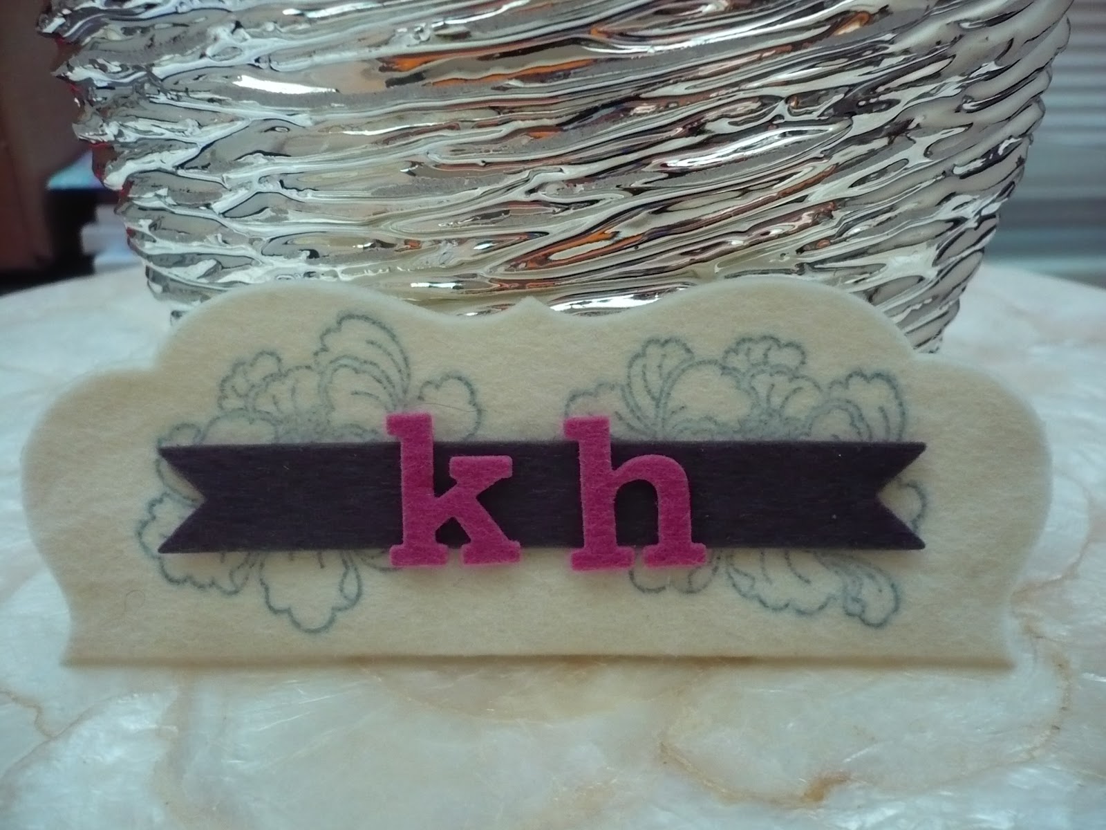
This one is for my cousin who has the initials KH. I am going to stuff this with some Hershey's Kisses as part of her birthday present. I stamped the Pretty Peonies on the white felt using Fresh ink's Steel Blue. It actually stamps quite a clear image, which I was pleased about.
I took some Smoky Shadow felt to cut a double ended banner and then Autumn Rose for the alpha cuts. The larger piece is one of the Mat Stack 4 dies (the largest one) folded in half.
I am adding some better shots in daylight as I made these feltie doodads late last night and the above pictures do not show up that well. :-)
A Simply Chartreuse Turning a new leaf die and the 'happy' from Pretty Peonies in Smoky Shadow.
Super simple but I like this colour combination. For this one, I am planning on stuffing it with tea bags for a tea aficionado friend of mine. :) I might add a button latch on top but for now I will leave it as is ...
And the brighter shots:
Supplies:
Stamps: PTI Pretty Peonies
Ink: Fresh Steel Blue
Dies: PTI Mat Stack 4 large die, Double Ended Banner, Alpha
Felt: white from stash; PTI Smoky Shadow, Autumn Rose
Adhesive: FabriTac, scortape
Felt: white from stash; PTI Smoky Shadow, Spring Moss
Dies: PTI Turning a new leaf, Pretty Peonies 'happy'; Lifestyle nesting hexagons
Adhesive: Fabritac, scortape
Monday, September 24, 2012
Papertrey's Impression Plates - samples and extra techniques
A friend of mine wanted to buy some of the impression plates offered at Papertrey so I offered to send her some samples. I used the Curvy Labels punch and cut a whole bunch to impress. I ran them through my Big Kick with the various IPs. I even added some cover plates used as IP's as well as Wplus9's chevron IP. Take a look if you want an idea of what they look like. Click the images to enlarge:
I have always had really good luck with them just running them through my Big Kick and with my Cuttlebug when I had it. I bought the embossing pads from PTI's website and they have served me well. Some people have better success adding shims or misting the paper with alcohol or water but I haven't needed to do that. I have used Perfect Pearls mist to add some shimmer but I get an excellent impression without adding anything.
I also love to do the letterpress technique where I use ink directly on the IP and then running it through the machine. Here are some examples I have shared from this post:
Damask IP with Fresh Ink
Mehndi IP with Fresh Ink
Hexagon Cover plate with Fresh Ink
Cane Print with Fresh Ink
And this post:
Giga IP with Distress Ink
And the technique shared on a Make it Monday over at PTI about double embossing is really cool - you use an impression plate with a die so that the die leaves a negative area where the card stock is not embossed. I made a card in this post using that cool trick!
Just be sure to have the order of your sandwich perfect, otherwise you will cut into the impression plate! :)
Which are your favourite impression plates? Do you like the more subtle debossing they give rather than embossing folders? What techniques have you tried so far?
I also love to do the letterpress technique where I use ink directly on the IP and then running it through the machine. Here are some examples I have shared from this post:
Damask IP with Fresh Ink
Mehndi IP with Fresh Ink
Hexagon Cover plate with Fresh Ink
Cane Print with Fresh Ink
And this post:
Giga IP with Distress Ink
Gina K chocolate cardstock, PTI Diamond IP, Colorbox Frost White Ink
Gina K chocolate cardstock, PTI Moroccan motifs IP, Brilliance Pearlescent Orchid (pink)
Gina K sweet mango, PTI Giga Guidelines IP, Distress Ink Spiced Marmalade
Gina K sweet mango, PTI Sunshine IP, Colorbox Frost White Ink
Gina K chocolate cardstock, PTI In Bloom IP, Colorbox Frost White Ink
And the technique shared on a Make it Monday over at PTI about double embossing is really cool - you use an impression plate with a die so that the die leaves a negative area where the card stock is not embossed. I made a card in this post using that cool trick!
Just be sure to have the order of your sandwich perfect, otherwise you will cut into the impression plate! :)
Cuttlebug Sandwich for double embossing:
A plate
B plate
Impression plate facing up
Die cutting side facing up
Paper facing down
Embossing mats - vanilla and tan
B plate
Which are your favourite impression plates? Do you like the more subtle debossing they give rather than embossing folders? What techniques have you tried so far?
Labels:
distress ink,
dry embossing,
fresh inks,
Papertrey,
PTI,
techniques
Subscribe to:
Posts (Atom)