Tuesday, February 12, 2013

PTI Anniversary Watercolour Challenge - Happy Mother's Day

For my next card answering the watercolouring challenge over at Papertrey, I decided to embrace the imperfection and just have some fun with my watercolours.  I painted a bunch of circles on a piece of watercolour paper and blended them in.  My Niji pearlescent watercolours even has a gold colour so I used that too for little shine ...
I mounted this to a white card base and then layered vellum overtop to mute the colours after heat setting the watercoloured piece to ensure it was completely dry.  I was going to do some heat embossing on the vellum but since this can warp the cardstock a bit, I decided not to.  I wanted to keep it as smooth and flat against the base as possible.
I added the sentiment pieces from PTI's gorgeous anniversary set from last year stamping them all with black StazOn Jet Black ink for a bold look that wouldn't smear.

A very clean and simple card but this will be used for Mother's Day either in a card set or for my own mother ... we will see what I decide! :)

Here's another card I did a while back using these same watercolours - this one shows the pearlescence effect of them:


Supplies:
Paper: Staples 110lb white, watercolour paper, Gartner's vellum
Stamps: PTI Pretty Peonies
Ink: StazOn Jet Black
Misc: Niji pearlescent watercolours, aqua pen

PTI Anniversary Watercolour Challenge - Hello

For this year's anniversary festivities, Papertrey has been doing a whole bunch of fun challenges.  I've been pretty busy so haven't been able to take part until now ... I thought I would try my hand at some watercolouring.
For my first card, I decided to try using Harvest Berries with some heat embossing and then colour in the leaves. So much for that plan ....
The little lines and holes weren't large enough for the colour to stick and show up so after getting a little frustrated with my original idea, I just watercoloured the whole thing with various shades of green pearlescent watercolours and then added some Studio Calico shine mist.  Embossed resist instead ...
I added a bold sentiment from Think Big Favourites and mounted the panel with some low profile foam dots to add it to a Spring Moss card base.

The pearlescent watercolours combined with the Studio Calico shine mist adds a nice subtle sheen to the layer but my photo doesn't capture that very well.  Just trust me, ok?! :)  It's got some sheen and the green is more visible ...  really, I promise!

Supplies:
Paper: PTI Spring Moss, Staples 110lb white, watercolour paper
Stamps: PTI Harvest Berries, Think Big Favourites
Ink: Memento Tuxedo Black, Versamark
Misc: Zing white embossing powder, foam dots, Niji pearlescent watercolours, Studio Calico shine mist

Monday, February 11, 2013

Festive Friday #1 - red, white and silver

The fabulous Meredith MacRitchie has begun a blog entitled Festive Friday to help us create holiday cards all through the year.  The challenge is to use red, white and silver.
When I saw this gorgeous colour combo, I puchased some silver embossing powder tout de suite with the idea that I would get some cards made right away ... Well, days later and I still hadn't had a chance to make any cards for this challenge.  I finally had a moment and got inky. 

For my first card, I grabbed some silver shimmer cardstock I purchased a while back with an M's coupon and made a clean and simple card.
Of course, by the time I ever get to take photos, it is dark so you'll have to excuse the bad lighting ... no light box for me!  I used a die cut from PTI's Happy Trails and smooshed it into my Fresh red currant ink pad to get the colour I wanted.
I used Versamark and some white embossing powder to stamp Technique Tuesday's Peace Joy and Love stamp set.  White embossing on silver always has such a cool look ...
Some low profile foam dots on the dove and I mounted the silver panel to a white card base leaving some white space peeking out.

My next card used silver heat embossed leaves (PTI's Mistletoe and Holly) with a white heat embossed sentiment from PTI's Think Big Favorites.
I mounted it on a white card base and added some burgundy and silver Stickles.  Gotta love the bling that Stickles bring! :)
The shine of the silver embossing is so pretty against the Scarlet Jewel cardstock - that embossing really pops on dark cardstock.
I am so sad that the Think Big Favourites series has come to an end - I just love larger more bold sentiments. 

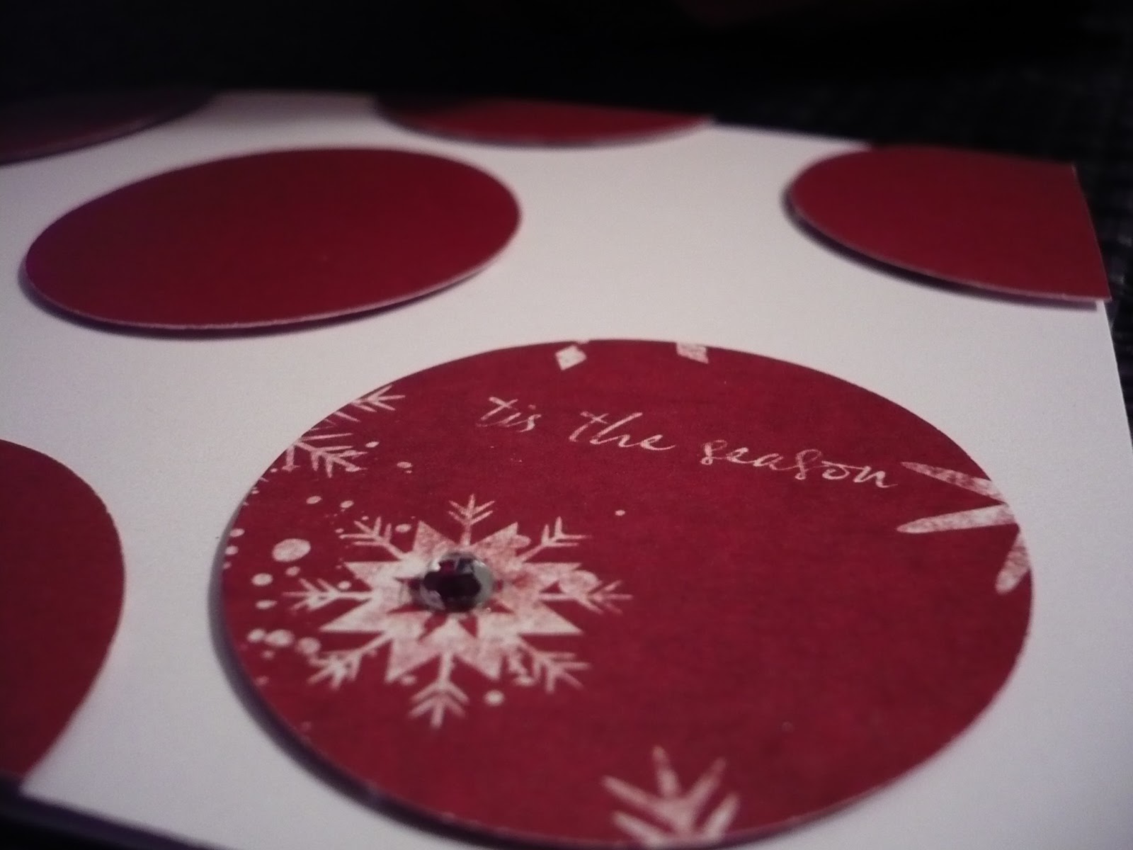
My next card made good use of my 1 3/4" circle punch and some holiday patterned cardstock.  I punched a bunch of circles and mounted them to a white card base.  I used the 'B' side of the cardstock for all but one of the circles and the patterned one (the 'A' side) had the perfect sentiment for the card - 'tis the season. Now that I'm looking at that one circle, I think it could move over a bit more to the right ... oh, well!  Gonna let it go for now and maybe move it a bit tomorrow.
I added a silver rhinestone to the centre of the snowflake on this one for a little bling.  Not sure if you can tell, but all the circles are mounted with low profile foam dots for a little extra dimension.
 
When I was playing with my silver embossing powder and starting out, I made this card and decided to add the red stars ... bad idea on my part but I'll show you the card anyhow ...  I just love that frame from Pretty Peonies ... why did I have to add those stars?!
Well, Meredith, congratulations on your fabulous beginning to your challenge blog - I am so proud of you! <3 br="">

Supplies:

peace on earth
Paper: Staples 110lb white, Recollections silver shimmer
Stamps: Technique Tuesday Peace, Love and Joy
Ink: Versamark, Fresh red currant
Misc: white  Zing embossing powder, foam dots


holiday wishes
Paper: Staples 110lb white, PTI Scarlet Jewel
Stamps: PTI Mistletoe and Holly, Think Big Favorites
Ink: Versamark
Misc: silver and white  Zing embossing powder, Stickles (diamond, burgundy), foam dots


tis the season
Paper: Staples 110lb white, Christmas patterned paper
Misc: 1 3/4 circle punch, silver rhinestone, foam dots


Thursday, February 7, 2013

Clean and Simple II: Glitterama Day 9

Well, they had me as soon as I saw the word glitter - say no more, I was willing to give it a go!  In certain instances, you just gotta have a little bling .... right?
The picture doesn't give a very good idea of the glittery effect but maybe it's because I used watercolour paper which isn't very smooth to begin with.  I swiped the paper with Distress Stains (bundled sage and broken china) and used an aqua pen to create an ombre effect from dark to light.
I stamped the sentiment from Studio Calico Snap On and then heat set the piece of cardstock very well before adding Sticky Stuff powder and then layering Rock Candy glitter and reheating to set.
*********************
I wanted to make one more card with Distress Stains using broken china and a metallic pewter as well.  I didn't add glitter to this one but mounted it on a light grey card base and added a dragonfly from PTI's Happy Trails and a silver embossed sentiment from the same stamp set. 
 I mounted the sentiment panel to the base with foam dots.
The pewter distress stain adds some nice shine and sparkle in person - it was a good purchase!


Clean and Simple II - Day 8 - fun with plaid stamping

The ingenious Laura Bassen shared with us a video on plaid stamping and I had such fun creating this card using her technique.  I created a mask with my QuicKutz hexagon nesting die and some Eclipse masking paper.  I then grabbed a stamp from PTI's Faux Ribbon and used the thickest 'ribbon'.  I flipped it around for a wider stripe.
I stamped the colours in an ombre effect with darker and lighter tones using a variety of Fresh inks (merlot, fuschia, red currant, and sugar).  I added the sentiment from Studio Calico Snap On with my ever faithful Versafine Black Onyx.
I decided this card needed a little something extra so I added some glitter (Rock Candy distress glitter from Ranger/Tim Holtz) using a Quickie glue pen.  So fun and sparkly in person!

So, thank you, Laura - your video was awesome and it was great to see your personality and humour thoughout.  You always inspire me with your amazing cards - you have such an eye for good design!

**edited to add a reply to a comment below - the video that Laura made is not public as it was in the Clean and Simple II card class but you basically just layer stripes of different colours side by side using a mask of any shape you like.  Sorry I can't share a link to her video, Kathryn! :) Here is an explanation that she did over at Ellen Hutson's CLASSroom.

Supplies:
Paper: Staples 110lb light grey
Ink: Fresh (merlot, fuschia, red currant, sugar);  Versafine Black Onyx
Stamps: PTI Faux Ribbon, Studio Calico Snap On
Misc: QuicKutz hexagon nesting die, Eclipse masking paper, Rock Candy glitter

Clean and Simple II - patchwork stamping and a little glitter

Another go at patchwork stamping with a fun sentiment - how can you go wrong with "oh, snap"?!!
I took a piece of white cardstock and stamped 'oh snap' from  Studio Calico Snap On using Fresh silver lilac, tuscan olive and steel blue.  I then punched it out with a 1 3/4 punch and used some foam dots
on a blue strip that I covered with a bit of narrow scor tape and some Martha Stewart blue topaz glitter.
I love using scor tape with glitter - it adheres so well!

Supplies:
Paper: American Crafts textured black cardstock, blue from stash, Staples 110 lb white
Stamps:  Studio Calico Snap On
Ink: Fresh silver lilac, tuscan olive, steel blue
Misc: foam dots, Martha Stewart blue topaz glitter, scor tape

Clean and simple II - day 6 - another go at patchwork stamping

 I liked the look of this technique so I tried it again ... what fun!
I made a super simple card with PTI's Rosie Posie hexagons and Hero Arts Made with love sentiment set.
For the patchwork stamping, I used a few Hero Arts mid tone inks - wet cement, cup o' joe, and red royal.  The graphic sentiment is stamped in the nice deep rich Versafine Black Onyx.

Have you tried this technique yet?  It looks great with solid stamps so give it a try!

Supplies:
Paper: Staples 110lb white
Stamps: PTI Rosie Posie, Hero Arts Made with love
Ink:   Hero Arts mid tone inks - wet cement, cup o' joe, and red royal; Versafine Black Onyx

Clean and simple II - day 6 - patchwork stamping

I had such fun doing some patchwork stamping today - it's a really cool technique!
I grabbed Rosie Posie from PTI and some Jenni Bowlin inks (weather vane, speckled egg and lavender sachet) and stamped the flower using the three colours.
For some texture, I used PTI's canvas impression plate and then got started on the sentiment.  I wanted to have the perfect colour to match so I swiped some Jenni Bowlin weather vane ink on white cardstock, heat set it and then stamped the Mat Stack 1 collection sentiment from PTI with Versamark and white Zing embossing powder.
Some pearls and  foam dots for the sentiment and the card is done!  I am definitely going to try this technique again.

Supplies:
Paper: Staples 110lb white
Stamps: PTI Mat Stack 1 collection 1, Rosie Posie
Ink: Versamark, Jenni Bowlin speckled egg, weather vane, lavender sachet
Misc:  foam dots, white Zing embossing powder, PTI Canvas impression plate


Clean and Simple II - embrace the negative space yet again

 I continued to embrace the negative space with this super simple card.  I love gray cardstock and found a medium gray (or is it grey?!) from SU that I bought last year.  If PTI ever comes out with a medium gray (or even a light gray!) I would be very happy.  For now I have a Staples light gray (even though the weight is not quite heavy enough for my liking) and SU's Basic Gray for a mid tone
I used WPlus9's Heartfelt Mix again using Versamark and lots of embossing powder (Zing gold and blush).  The little clothes pin is Versafine Black Onyx with some clear Zing embossing powder.
I just love that blush embossed chevron heart - such texture!

Supplies:
Paper: SU Basic Gray
Stamps: WPlus9 Heartfelt Mix
Ink:   Versamark, Versafine Black Onyx
Misc:  Zing embossing powder (blush, clear, gold)

Clean and Simple II - more masking from day 2

 So I tried the double masking from the other day over at the online class Clean and Simple II.  This is inspiring me to make cards in different ways and try some techniques for the first time and revisit others that I haven't done in a while. 
 I masked using an Angled Labels die (PTI) to make a mask from Eclipse paper and then sponged over some pale blue ink (Fresh sky blue).  I used the reverse of the mask to stamp the Studio Calico grid pattern background stamp using some Fresh slate ink.
Then I stamped Edward's name using Alpha Dots from Paper Smooches to personalize the card for little E who is a new arrival to one of my colleagues.  I used a Fiskars Baby Boy set for 'baby' and stamped it all using the nice and dark ink ( Versafine Black Onyx).
I used some stamps from the Fiskars set on the inside of the card with Versafine Black Onyx and Fresh red currant.

I like making my cards as personalized as possible and what is more personal than the baby's name itself! :)

Supplies:
Paper: Staples 110lb white
Ink: Versafine Black Onyx; Fresh sky blue, red currant, slate
Stamps: Fiskars Baby Boy, Paper Smooches Alpha Dot, Studio Calico grid pattern background stamp
Misc: Eclipse masking paper


Sunday, February 3, 2013

Embrace the negative space - Clean and simple II

So I am new to the whole misting and splattering ... I bought a few bottles but haven't used them too often.  I had an idea for a sentiment that would work perfectly for a splattered card.  I grabbed my Studio Calico Mister Huey's mists in shine and opaque white.  I used my box that I mist and do any other messy techniques in - it works well and keeps the work area clean.  I flicked a bunch of the ink onto the kraft card stock and then took it out and let it dry a bit before stamping.
I made the sentiment using Kelly Purkey's Plain Jane stamp set - I love the modern graphic look of this font.  I stamped it with Versafine Black Onyx and added three dots from PTI's Polka Dot Basics.
Hard to see the shine, but it's there - promise! :)
I added the sentiment from WPlus9's Heartfelt Mix - just perfect.  A Versamarked heart from the same stamp set and the card is all done.

So I think I embraced the white space ... even though it wasn't white after all.  And I finally did some ink splattering ... :)  This is the perfect card for a friend of mine who is going through a tough time - I think this will work well ...

Supplies:
Paper: PTI Kraft
Stamps: Kelly Purkey Plain Jane alpha, WPlus9 Heartfelt Mix
Ink: Versafine Black OnyxVersamark, Studio Calico Mister Huey's (opaque white, shine)

Embrace the negative space - Day 4

This class is a lot of fun and I am having a great time watching the videos and getting ideas and inspiration.  I have been pretty busy so have only managed to make cards sporadically rather than every day ... Oh, well - I am doing my best and still getting a lot out of the sessions! :)
I bought some wood veneer from Impress Rubber Stamps recently and decided to try die cutting it.  I stamped the text from PTI's BB Text Style in birch ink.  How appropriate that that's the name of the ink, right?!
I die cut the heart and also did some clouds at the same time - it cut like butter!  I stamped the arrow from  Studio Calico Snap On in chocolate ink on the card base and on the heart itself ... A few foam dots and the heart has a bit more dimension.
 The sentiment is stamped in Fresh ink's fuschia and then heat embossed in clear from the same stamp set.
 I will definitely be playing more with these wood veneer sheets ... what fun!

Supplies:
Paper: Staples 110lb white, Impress wood veneer sheets
Ink: Fresh ink - chocolate, fuschia, birch; Versamark
Stamps: PTI BB Text Style,  Studio Calico Snap On
Misc: WPlus9 Heartfelt Mix (heart) die, foam dots, clear embossing powder